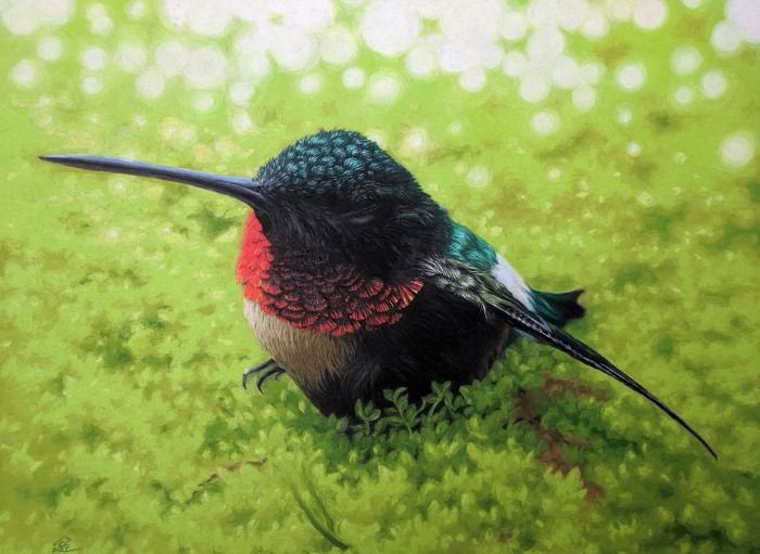
“Fragile”, my latest adventure, is newly complete. It is my largest oil pastel work yet at 24″x29″. The piece was inspired by a hummingbird I found injured under a feeder. He was likely on the losing end of a territorial battle between males, and was lying motionless on the stone ground. I wasn’t sure how to help, but I scooped him up and gave him some sugar water, watching to see if he would perk up. He did recover in a couple of hours, and took off to hopefully have a better day.
It’s not often you get to see any bird so close, particularly one that is constantly in motion like the hummingbird. Its metabolism is so high it can die in a matter of hours if it doesn’t either eat or fall into “torpor”–a high price to pay for an energetic life. (Here is an interesting explanation of hummingbird metabolism–https://journeynorth.org/tm/humm/EnergyTorpor.html)
I knew I had to try to depict the fleeting beauty and frailty of this tiny gem. This piece needed to be large, large enough to really give the viewer a close-up look at this bird’s beautifully constructed metallic feathers. With help from the office supply store, I divided my reference photo into two halves, which I had made into two 11×17″ prints, then I taped the halves together for a nice large reference.

Two big changes with this piece: new pastels and new canvas. This piece is larger than any canvas pad I can easily obtain, so I bought a 5′ roll of double-primed cotton canvas online.
Next, I got a pricey but worthwhile set of Sennelier oil pastels. I pretty much had to learn how to use OPs all over again when I went to use these. Where other varieties I’ve used are matte, firm, waxy or even crumbly, Sennelier is like a tiny tube of lipstick. It goes on smooth, thick and glossy, leaving the impression of a oil painting. The depth of the glossiness makes for luminous lights and richer darks, but the soft stick is not well suited for tiny details unless I’m using a tool to paint (or making a very large piece). I’m using firmer but reliable Mungyo Gallery for much of the background and detail work in this piece.

As far as details go, I’m finding that larger is better for more complex work. I can only make something so small before finding the OP is just too big to make a precise mark. Note the work of pastelist Ruben Belloso here: https://wooarts.com/ruben-belloso/nggallery/image/ruben-belloso-adorna-paintings-wooarts-com-06/
This art is stunning–highly detailed and photorealistic. It is also large. Tiny details are a lot easier to paint at 6 inches than at 6 millimeters.
The lightest highlight colors go in first–yellow, bright blue, white. Next, they will be covered with the darker colors to match those in the photo. I use a clay cutter tool to gently scrape away the darker color wherever I want a highlight, a technique called “sgraffito”.

In previous work I’ve labored long to remove tool marks. Smashing them into the oblivion of the canvas, smoothing over their sculptural quality and blending the colors into a bit of mud. But part of what separates this piece from a photo is the evidence of its handcrafted nature, full of movement and texture. It’s been a lesson in self discipline to simply make a nice intentional mark and just leave it, rather than doing the “smush”.
For this piece, I’ve mostly blended with the OPs themselves rather than my fingers, which keeps the painterly look. To make it look exactly like my photo would defeat my purpose. If I have to, I can always blend with my finger, then go over the top with the pastels themselves to bring the texture back, or I can hand mix the blended color off canvas with a rubber shaper, and brush the blended color on.
This is a good opportunity to show you what tools I’ve been working with:

The question has been asked many times– is oil pastel work considered painting or drawing? Discussions I’ve seen suggest that in cases where the medium at least mostly fills the canvas, working in shapes rather than solely lines, it is painting.
This is where the line between drawing and painting really blurs for me. Dipping a rubber brush into a palette with oily smears of OP, adding details this way definitely feels more like painting–but without the drying time-limit of acrylic, or the funky fumes of oil paint. It’s the closest I’ve come to oil painting but with even more direct contact with the canvas. I even sometimes use a paintbrush for pulling thin layers of color.


My main challenge with this piece is maintaining consistency in lighting and texture. I was initially confused with the colors of light bouncing throughout the photo. Warm sunlight hit the ground nearby, shining nearly yellow thru the green moss. But overhead is the cool suggestion of sky, evident in the bluish highlights on the bird’s head. I went with mostly cool shadows and warm lights, except in areas where the light was not coming directly from the sun behind. Practice and observation will likely make this easier for me to figure out.

I’ve started laying the background color in circles, which is fun and prevents a texture of scribble lines from developing. To simplify my hummingbird’s surroundings a bit more, I’ve outlined some general shapes on my back-up reference print and roughed in the color on top with OP. Looking at my composition armature also helps me arrange the background.

However, I’ve got to remember that some things that look great in the photo just look weird on the canvas. I can’t lose sight of the fact that I am making not a photo but a painting. It is frequently necessary to deviate from the reference to create a pleasing composition. Sometimes a line or a dab of color will just “feel right”, and this is where the soul of the piece (and its maker) really shows.


Mostly through the piece, I’m running out of green and patience. I take a needed break while waiting for my new jumbo pastel in the mail.
The “Grande” is unexpectedly huge. I may not run out of this color ever again.
When I hit a snag in blending the background, I rolled my whole table outside and was immediately refreshed by the change in perspective, if not the 95-degree heat index. The natural light reveals things I didn’t notice indoors, and the extreme heat makes even my crumbiest OPs smooth as butter.

The last step is to create the hazy light effects of the background. This is mostly a lot more strategically-placed circles, using yellow and white toward the middle of the picture where the warmer light is, and palest green and white toward the top of the picture where the cooler light begins.


Finally, after burning the midnight oil one night, “Fragile” is finished. It will be making its temporary home in a local gallery soon.
Stay tuned for future posts on how I frame professionally on a budget, and more tips for what to do when you hit a snag in the middle of a project. Adios for now!

I am very impressed. Not only is your artwork gorgeous but your blog is very well put together with clear writing and vivid descriptions of what you’ve done. Since I’ve focused on oil painting I found your description of the pastel process enlightening. I’m contemplating beginning a blog and really like yours. Nicely done!
LikeLiked by 1 person
Bethany, thank you for your encouraging words. If this blog entertains, inspires or educates even one artist, then I’m happy! Best of luck and blessings in creating your new blog!
LikeLike