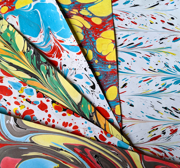
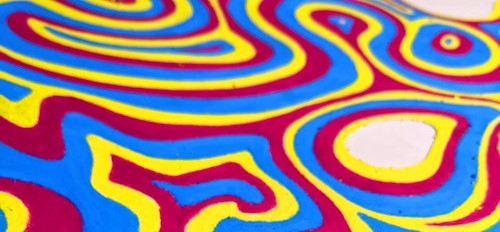
Cried My Eyes Out II

Many of my works have specific meaning behind them– some are social commentaries, some are illustrations of possible worlds or realities, others are meant to encourage the viewer to appreciate something normally overlooked.
This one…well, it’s a literal interpretation of a pun.
Yes… that’s it.
It begins with this piece I made in pencil in 2017, before I began my foray into the world of oil pastel.

Prompted by an eye-themed local art show this month, I’m not reworking this pencil piece–I’m starting from scratch in oil pastel. I worked to the best of my ability at that time, but with five more years of skill development and practice, I’m fairly confident I can improve on it this time around.

I’ll first both take and find a large collection of reference photos, which I combine into a collage in an editing program, and then have printed at a local office supply. Next, I select my frame and mat. I have a beautiful oak frame in the right dimensions which I will recondition. The accompanying mat will be painted for a complementary look, then I’ll attach acid-free spacers to raise it away from touching the work.

I trace the dimensions of the inner part of the mat plus 1/4″ onto my “canvas” of toned matboard. Next, I’ll sketch in the eye. I’ve decided on a slightly different position than was used in the original.


On to the color stage. I work from the outside in with a limited palette–a dusty pink, a rust-brown, very deep burgundy for shadows, and a small bit of cool pale grey for highlights.

It always starts out neat like this–by the time I’m finished, I’ve dispensed with organizing any supplies and there are smears of pastel on everything.

I’ve got less experience working with cool lighting, but the cool lighting in this piece means I’ll be learning a lot more about rendering warm shadows. Despite this challenge, the texture of the skin is a blast to paint. Next is the sclera (the off-white area surrounding the iris), which is stretched out in a Dali-esque mid-drip. For the iris color, I’ll use a blue-grey similar to the original piece.

Eyes are both fun and frustrating to paint. Despite their small size, the tiny muscles and the way light scatters across the iris make for a whole world of beautiful, impossibly complex detail. What we typically observe about perspective and color is also distorted in an eye. The “whites” aren’t perfectly white. The clear dome-shape over the pupil, much like a glass paperweight, means the placement of the iris appears to move depending on your perspective. Light that highlights one side of the iris, scatters and illuminates the opposite side.

Even a “blue” eye isn’t always solid-blue up close–many eyes bear freckles of different hues.
Once I reach the iris section, my method of color application more closely resembles oil painting (with a rubber brush) than coloring with a crayon.
With Winter approaching, the light of the day fades quickly and early. I do much of my work up close by my small full-spectrum desk lamp. This stage seems to stretch on forever. Once I’m finally ok with the look of the iris and pupil, I am able to paint in the “eye-drop” toward the bottom of the piece very quickly.

Eye-drop close-up is shown here after I applied the skin texture. The edge of a pencil eraser works beautifully for blending more precisely, provided I move in only one direction or use it over very thickly applied pastel. As a side effect, it seems to also slightly lighten the colors and remove some oily shine, making it ideal for putting highlights on skin.

Contrasting with the fussiness of the eye-painting stage, putting in the skin texture around it is almost effortlessly fun. I simply scribble back and forth around the eye in pink and brown pastels, layering them, then smearing and blending with my fingers.

I’m now nearly finished with the work, and on to my favorite stage of deepening shadows and brightening highlights. I don’t want a shine on this piece, so I go over some of the glossier areas gently dabbing (not smearing) with my fingers to impart their texture.

The piece was dropped off for a local display as soon as its completion. It will not be glassed in, so this will be an experiment in the oil pastel’s durability.

Glass-free display….eep!

I won’t lie, the original in pencil was definitely less finicky (or maybe I was?). However, I enjoyed the challenge of re-creating it in this oily medium. Next time I tackle subject this detailed, I may save myself some time obsessing, and work with a looser more painterly hand, or perhaps create the work in a larger size to allow room for inserting smaller pastel-strokes.

Upon completion, I was happy to see my growth and progress as an artist displayed in a concrete way. Once again, though it isn’t 100% what I would have liked, I worked to the best of my ability which has improved visibly over the past few years.

Creatives, I highly recommend re-doing a work from earlier in your artistic journey. I think you’ll be encouraged by the experience.

Ersticken

With the arrival of Spring, has come the arrival of experimental new ideas to try out. My mind stretches out and warms up with the weather.
This particular experiment begins with someone else’s artwork.

Image 1. Sander on a vintage framed forest scene, artist and title unknown

To whomever painted this 4’x2′ monochromatic landscape some 50-60 years ago, thank you. It graced my bedroom for years as a teenager, then years more in my own downstairs family room. My newest work will express a concept that requires a lot of space–at least 48 inches. After months of fruitless shopping around for a large enough canvas or frame, I realize I actually have what I need already, in this oversized painting.

This project will be another ambitious stretch…both figuratively and literally. First, there is a deadline. I need to complete it in time to join a display of artworks sized over 4′ which will be hung in a regional airport.
Second, before I can even begin my work, I must first undo someone else’s work. The prep on this one is a painstaking multi-step process. The nails holding the painted masonite board in the frame must be pried up, the board popped out, then hours are spent on my least favorite prep activity: sanding.

I feel a little twinge of regret at sanding this small detail I added myself as a teen, a shadowy tiger looking out of the monotone “forest”. (My room was jungle-themed and I couldn’t resist.)

The idea for this piece, which I plan to call “Ersticken”, originated several years ago when I participated in a “sketchbook project”. Blank sketch journals were given out by a local gallery to be filled by area artists, then returned and mailed to a massive library of completed art sketchbooks. The project was great fun and inspired several ideas with potential for full-sized works. Sadly, my journal was stolen from the gallery before it could be mailed out. However, it had been scanned prior and the idea from this particular spread I drew has stuck with me.

Image 2. Scan of semi-abstract artwork in a sketchbook

While I prep the board for painting, I also need to address the frame. Without the board inside, it’s a bit unstable, so I attach strong metal corner braces. The frame has been either knocked around then repainted several times, or it’s been intentionally “distressed”– it sports multiple nicks, gouges and a couple of chunks are just missing. I carve pieces of wood to match the missing chunks, glue them in, and carefully whittle them down to the frame’s shape. Smaller nicks are treated with fine wood filler and sandpaper.

After many hours spent on prep, the frame is in beautiful shape: ready for primer, then a smooth matte paint. Unfortunately, this is May in Missouri, which means a solid week of rain coupled with temperatures around the 60s. Typically I spread a drop-cloth outdoors and paint frames out there, but there is no dry place to do that–and the humidity is preventing the paint from drying. Eventually I manage an awkward setup involving tape, a back door and sheets, and the frame is finally painted. Next, I apply an untold number of coats of gesso over the masonite board laid out on my living room floor. (I don’t even have pictures of this particularly mind-numbing process). This is then sanded to a smooth matte white finish, meant to emulate a sheet of paper or a primed canvas.

With the board and the frame prepared, I can begin the real fun.

This piece will be unlike any other I’ve made, incorporating oil paint, cut canvas, and oil pastel in one painting. The left side contains a large, organic flowing shape, which I have cut from primed canvas. I affix it to the board with matte medium, taking care to avoid the areas I’ve cut out within this shape.
The right side will have the oil-painted elements. There are three “metal pipes” which come into the picture from the top and the bottom, leading to an antique faucet. Rarely have I worked with oil paint in the past, but this piece requires it. I spend several days observing my reference photos and practicing painting the pipes. When I’m satisfied with those results, I mask off the area I’ll be working in and block in a grey base coat for each pipe. (Seen above)
After several days of setting the picture in front of a fan, in a hot car, and over a heat vent… the pipes are finally just barely dry enough to add in highlights and details.

Next, the part I’ve been most looking forward to. I add freeform swirls of color to the canvas shapes, using oil pastels in vibrant primary/printer’s colors: Cyan, Magenta, Yellow.
This part is especially enjoyable, as I jump in without a set expectation and simply go wherever the “flow” takes me.

Image 7. Adding color to canvas shapes

The following steps are much fussier. Once the colors are roughed in, I need to smooth and define the edges of each color so that they are separate and do not bleed into each other. To accomplish this entails using a rubber brush to paint literal yards worth of edges in oil pastel, which has been thinned into “paint” using turpentine. During this process I make a delightful discovery: misplaced oil pastel can be erased.

Because this piece will be framed but it will not be glassed-in and matted, I will need to protect the oily texture of the pastel from smudging on the frame or whomever needs to handle it. First a particularly ridiculous masking job isolates the pastel sections, then several separate coats of a specialty oil pastel fixative spray protects the pigments.

Image 10. This is undoubtedly some of the craziest masking I’ve ever had to do. I also ran out of drop-cloth…

I’m getting very close to finishing this piece, but it’s not complete yet…and the deadline is a literal day away. Still left to be done is the white background. I need to remove any smudged paint and pastel bits that may stain it. I’m up late on my last night cleaning it up and sanding it to a matte finish again, then sweeping the sanded bits off the painting.
When I brush over the oil painted pipes, I’m suddenly reminded that they are not really dry, they are just pretending to be (again, it’s May in Missouri).
Next morning, every spare minute is spent carefully addressing the resulting scuffs, framing the piece, and praying that I make it before my noon deadline.

Image 13. Sanded the whole background by hand. Yes, I’m a little crazy

I do make the deadline, at exactly 12:00 PM, with a piece I’m particularly proud of.

Image 14. “Ersticken” in Sky Gallery, 27″x51”, oil pastel, acrylic and oil paint on masonite. 2022

Ersticken means “stifle” in German. I enjoy letting the viewer interpret the piece, but I can say it marks the start of a new series using color to break out of boundaries.
I’m excited to see where this series will take me.
Til next piece, Ciao…

Waking Up

Since my last post, I’ve made several new pieces and shared them with the world.
I’m particularly happy with this one, a combination of two of my favorite things…otherworldly themes and oil pastel.
This one is an experiment in texture and lighting, a fun little throwback to some of my earlier fantasy work, and my own contribution of hope for a world in near-constant turmoil. A reminder that Spring does eventually come, no matter how cold and devastating the winter.
A close view of “Waking Up”:

The figure is my interpretation of “Mother Nature”— young, dormant and not yet weathered by Summer. She is pregnant with Spring-yet-to-come. Still mostly asleep under her protective blanket of snow, she lifts one sleepy eyelid, beginning her important work of waking the forest around her. Her hair is the roots and branches of a twisted dogwood tree, forming buds in preparation for its display. Her skin shares the tree’s bark-texture, and a faint blush of new green has appeared on her cheeks.
Scroll to see the making-of this piece. We begin with reference photos:

Reference photo of snow, light and shadow

I need to study the colors of the snow in the low light of sunset/sunrise. Very little of it is just “white” as I understand snow to be. The shadows are a strong blue. The sunlit patches are more a pale yellow, even in the brightest spots.

Doll posed on floor with light and flowers

This piece shows me what ridiculous lengths I’m willing to go to for good references–the above is my daughter’s doll, with paper flowers, posed on a cloth on my bedroom carpet, backlit by a flashlight. I have to move a piece of furniture and lay sideways on the floor to snap it. I pose the same doll in a snowdrift to better understand the cast shadows I need to paint. Then, I snap some photos of the stars of this “show”, the humble crocus.

Crocuses are some of my favorite blooms, because they are some of the first harbingers of warmth and green and cheer returning to a cold, stark world. They can bloom in snow, hardy and defiant to the Winter surrounding them.

My final reference shot is one of myself in front of a mirror, in a similar pose as the doll. Next, the fun of drawing begins. First, I have a look at my oil pastel rough-sketch.

Then I cut a piece of warm-tone matboard to 11″x14″. A sketch goes on next, then laying down the lights and darks. This step of establishing the darkest and lightest shapes is essential to create a balanced and dynamic composition.
At this point I’ve also started adding in secondary details to balance out the foreground, like a fallen log and a few early plants poking through the snow.

So far, I’m pleased with the sketch– but everything changes the moment color is added. The sketch will be totally obscured and the tonal values I’ve established will become even more important. The base layer consists of a thin coating of my harder, less “oily” pastels. Its purpose is to establish the basic colors I’ll be using, covering the bumpy brownish background of the matboard. It is also much easier to paint the later fine details and textures on that smooth base layer. Below, the background can be seen roughed in, and I’m filling in my main character and the foreground. I’m using my higher-quality, oil-paint textured pastels on top of the base coat.

Background and subject painted in.

This is where I stall out. Every piece I do has its sticking points where I need to learn something new, so I’m not surprised. I can’t figure out how to compose the foreground in a way that makes sense and doesn’t distract from the subject.
First I try drawing in the tree’s shadow. It’s easily the most complex part of this whole piece, due to its odd shapes that are distorted not only by the low angle of the setting/rising sunlight, but also by the uneven terrain they fall on.

Weird tree shadows

Yeah, that is definitely unnatural and distracting. After taking a long break to get fresh perspective, I look at a small version of the piece on my phone so I can mark-up what needs worked on. Several spots catch my eye right off the bat. Then, I increase contrast to create a “notan”–a Japanese term meaning “light dark harmony”– that helps me simplify my composition so I can spot imbalances and figure out what the foreground is missing.

The conclusion I usually come to on these sticking spots, is to simplify, simplify, simplify. I removed the ill-placed foreground log and brush earlier. Now, I know I need to simply suggest the tree’s shadow and connect it better to the subject’s shadow. With this plan carried out, I can now focus on the final step– details and textures.

Oil pastel can be highly textured, even sculpted using tools. I’m going for an Impressionistic look for this piece, with leading lines pressed into the pigment to create movement around the piece and add interest to “quieter” (low detail and contrast) areas.
The tool I most use is a plastic clay knife. The sharp tip is for scraping textural lines in. The flat side of the “blade” is perfect for smudging and blending similar colors together like the different tones of the shadows.

Though it’s a step with less obvious results, this is an important and time-consuming step that refines and ties together all the different elements of the piece.

Finally, I consider this piece complete. I have enjoyed the lessons I learned on composition, as well as plenty more practice with the complex and characterful medium that is oil pastel.
Happy Spring, readers. May it be regenerative and hopeful for you.

Waking Up, 11×14″, oil pastel on paper, © 2022

“There’s Daddy”


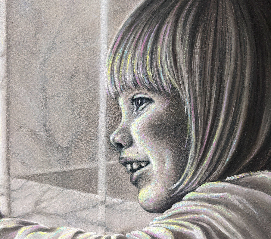
This one is close to my heart, and not just because it’s my first real attempt at portraiture–it’s a Father’s Day gift for my husband, the subject being our little girl. Portraiture is way out of my comfort zone, but I do enjoy a challenge.

Reference photo: daughter pointing to Daddy outside

It began with the “what if I….” thought that these challenging projects always seem to start with.
I was absentmindedly browsing through family photos, Father’s Day coming up, and it struck me–
“What if I make this photo a gift for my husband?”. (He is very hard to shop for).
The photo is cute, with strong contrast and a fun pose that might actually make a good reference for…art!

“Yeah, I’m gonna paint this thing instead!”

I should know by now that I always gravitate toward the more difficult option in any situation. Now I’m glad that I did.

reference sketch on lightweight paper

I launched into it with a deadline, meaning I had to land on a reasonable size, find a frame + mat, and get my reference photo printed to fit those dimensions ASAP. Oh, yeah–and choose my medium. Having just finished another oil pastel piece in my nature series, I needed both a break and a new challenge.

Soft pastel would give me plenty of control over lighting and detail. Though I would have liked the fun of making it in color, I went with grayscale to simplify the composition a bit. I chose a mid-toned, lightly textured paper which was delightful to draw/paint on, but it was also too dark to trace a sketch directly over the reference photo.


Instead, I drew a simplified sketch onto lighter paper. I then turned it over and held it up to a light, sketching over the lines showing through onto the back of the paper with a soft black pencil. It looked awful, but I flipped it back over and put it on the toned paper, pressing over each line to make a sort of graphite transfer out of the sketch. And now the real work began.

The outlines are ready to fill in

Though I was impatient to draw my subject, I blocked in the composition surrounding the subject first, working top down and saving her for last to lower the chances of smudging my work. The window was first, followed by the scene outside. This one had a lot of fun textures–the shiny wood window frame and the trees and brick wall outside.

My biggest challenge was de-cluttering the background. Bare winter branches were poking all over in every direction and the lighting was harsh and confusing.
I drew in some poorly planned imaginary trees which I reworked way too many times before finally replacing them with a simplified version of the reference photo.

Now I had established the direction of lighting which would set the tone of the rest of the piece. I used my fingers to blend larger swaths and tortillons for finer spots.
I ran into some unexpected challenges with this piece. At one point my lamp broke… so then I worked in my sunroom to catch the natural light, and I nearly passed out in there from the heat. I had been so far into “the zone” that I had barely even noticed the mercury creeping up over the morning.

(Note to self: check the thermostat every now and then!)


I don’t know if knowing the person you’re painting makes for a better portrait, but I definitely enjoyed painting this face. This is where much of the focus would be, so everything needed to be just right. I liked the technical challenge of matching the photo and the more abstract challenge of trying to capture the magic and authenticity of a fleeting moment.

Over halfway done

Initially this was about disassociating from the subject and instead focusing on the shapes her image is made of, the negative space around them. I actually worked on it turned upside down to better capture the “abstract” shapes. Then I flipped it back over to lay in the detail. I tried to steer clear of hard edges for all but the areas in brightest light and of highest contrast.
Here, her profile, upper part of her sleeve and her hand all needed to be in sharp relief against the background. I tweaked the tones of her immediate surroundings to better contrast against her outline. Playing with light is one of my favorite things to do, like the reflected light bouncing off of her white sleeve and onto the lower part of her hand. My goal is to eventually be able to do this with the finesse of the masters–but on a smaller scale.

Now with piece nearly done, it resembled my daughter enough for my liking. However, it seemed a bit “off”–the quiet greys and leafless trees were oddly lifeless compared to the energy of the picture’s subject. Then, I had an idea.
Light is a crucial focus in this rendering, and “white light” as we see it, is really just a combination of every color. I was planning on a restful greyscale piece, but I needed to break out my colors.

Little dots of neon lime, pink, blue, and yellow added instant life to the painting.
It still registered as “grey” from a distance. Then up close, it sparkled with color like confetti–matching the vivacious spirit of the subject. I dotted in some dust motes for added interest in the left side of the picture, and called it a wrap.

“There’s Daddy”, 12×16″, soft pastel on paper

I really enjoyed this piece. Getting to make a portrait of my daughter was lovely, and just the right amount of difficulty to keep it interesting but not too frustrating. I nearly-but-not-quite made my deadline of Father’s Day, just a couple of days past it.
The best part was presenting it to the Daddy it was created for. He was both surprised and pleased!

“Finally”

Is it my last piece of 2020, or my first of 2021?
Starting in September, my latest oil pastel piece has kicked my butt, challenging every technical skill I’ve learned so far. It required the use of over 45 different pastels, multiple tools and untold hours of tweaking details. References included 142 photos of casement windows and locks, sunsets, suburban lawns, fences, storms and wagons, some of which I took myself.

small close-up of sky section

This artwork is a departure from my nature glamour-portrait series, but by no means a departure from my style. A quick history:
The first artwork I really put effort into as a kid was fantasy-themed, usually centered around magical creatures.

It provided a creative outlet and a haven from the drama of my teen years, and the difficulties of a family under pressure. Over time, I drifted from fantasy toward surrealism and concept illustrations, which I still favor along with natural subjects.
This most recent piece came to me in a dream. Most of my dreams are varying flavors of bizarre, but this vivid scene through an open window stuck in my imagination. I didn’t feel quite skilled enough to capture it, but I was compelled to try anyway.

This one needed to be large–large enough to help create the illusion of looking through a real window. A canvas I had prepped with grey gesso was large enough, but super rough-textured. I had just about given up on finding a smoother, nearly 4-foot wide sheet of paper.
While I was at a hobby shop on my way to get the canvas dry-mounted, a shelf of framing supplies caught my eye. I found a huge piece of grey matboard.
This unconventional surface had the perfect texture and tone and needed no mounting. Best of all, it fit my huge thrift-store frame perfectly. I prepped it with an isolation coat of workable fixative spray, then brushed on a layer of matte medium, and voila–ready for pastel.

30″x40″ matboard, taped off and ready to go

First came a composition rough draft on paper and a color draft on cardboard. Since the image is from a dream, all the references were real-life approximations of imaginary elements and I had no good example of how the sky should look. I had been taking and collecting reference photos for months. I worked from several different photos of sunsets and storms.

One of the early composition sketches

The next step was the placement of the supporting elements in the picture.
There was supposed to be a red crayon on the windowsill, and a red wagon and ball that sit on the lawn. Since I couldn’t recall exactly how things looked in my dream, I took reference photos of my daughter’s wagon and ball in several different arrangements. To ensure I got the lighting right, I put a color filter over my photos in a free editing program. Filters skew how we see individual colors, so I used a sheet of white paper with a piece cut from the center to isolate each element of the photos and color-match correctly to my oil pastels.

I roughed in the background first. Then I traced the wagon photo on my computer screen onto paper, cut it and a ball out and placed them in different spots on the background. I used a red pastel to stand in for the red crayon. I took a photo of each option before choosing a final arrangement.

For this piece I worked dark to light, setting up the lights to blend into the darks. My next challenge was working with different pastel brands and textures. I put down the cheaper, more opaque colors first, adding the softer and more transparent colors on top. The sap green I used was definitely the pickiest, with a lustrous color but an off-putting grainy texture.

At the midpoint of this piece, I gave up keeping organized track of my pastels at this point and just separated them into cool colors (mostly greens and greys) and warm colors (yellows, reds, browns). It’s probably best to store these messy, sticky tools in a disposable or lined containerlesson learned!

two palette boxes

When pursuing a project this size, I always run the risk of losing momentum partway through and getting exhausted with it. Large projects have a more distant finish line, which can be discouraging to me. What usually helps me is stop for a few days and make a totally unrelated small project from start to finish.
This gives me a refreshing dose of motivation and proof that yes, I can finish a project.

Evidence of how long this project took me: I managed to make two scarves, some jointed dolls, an elaborate Christmas ornament, multiple wreaths, a batch of sauerkraut, and an entirely separate piece in soft pastel…during the time it took me to finish this one work. (I needed a lot of breaks!)
Some of it is displayed below:

Another way to refresh yourself during a long project is to get a change of scenery, if at all possible. I was lucky enough to be able to take my work to a small socially-distanced artist’s retreat in the fall. If you can’t take your work to another location, you could try working outdoors or in another room, using a different light to work under, anything that will help you get a fresh perspective.

Transporting a medium like oil pastel which never truly “dries” (and also softens in heat) is a unique struggle. I used light plastic drop-cloth which I draped over the piece and tied loosely in the back.
While normally this works really well to prevent lint build-up in short term storage, the work did “melt” a bit onto the drop-cloth in the heat of my car. So I would do well to avoid covering it in heat.

At work in natural light

The sky being the most dynamic part of the picture and the source of the lighting, I finished it first. To get the colors I needed for the sky, I actually cut pieces from the bottoms of the pastels that I needed to blend, mashed them up a bit to soften and mix them, then used a rubber shaper brush to paint them on. My palette was a little aluminum piece from the bottom of a cinnamon roll tube, which I just threw away when I was done.

After three months of work and a busy holiday season, this painting was shaping up to be complete soon. The window frame was the simplest but by far the most frustrating part yet–if you’ve never tried to make a straight edge in oil pastel, I wouldn’t recommend attempting a dozen of them in one piece!

before the frame completion, in greyscale to check values and contrast

Once I had reworked the frame edges as much as I had patience for, I was ready to put finishing touches on. All that remained would be highlights and possibly adding a reflection on the open window–something that could make the piece or break it if I didn’t get it just right.
I avoided finishing the painting for days so I wouldn’t have to face potentially messing up months of work. I finally had to draw the line when I realized I was approaching the new year with a piece I started in September, and I couldn’t avoid making a decision due to fear of failure. I took a deep breath and worked a reflection over the sky I had spent hours on weeks previously…
and it actually turned out better than I thought it would.

a quick snap of the finished work

I also got to portray textures that I haven’t had much experience with yet, like brass, lawn, and wooden fence. All in all, I’m very pleased with the result and I’m also pleased to be done. The piece is tentatively titled “Finally” (which has nothing to do with what I felt like when I finally finished it). It’s a striking piece, and its interpretation I will enjoy leaving to the viewer.
I’m ready to take a needed breather from large works for awhile.

Normally I have my work photographed for print-making (shout-out to my pro photographer brother!). However, this piece is awkwardly large and quite glossy. I opted instead to have it scanned by a nearby printing company, where their impressive industrial scanner can make contact-free captures of art up to 6′ wide. Here is a low-resolution version of the scan.
To purchase a print, click link below-
Finally / armageddon red light sky storm print, conversation piece Pastel by V Leigh Carr (fineartamerica.com)

“Finally”, 2020. Oil pastel on matboard, 20″x30″ (excluding borders)

“Dangerous Dance” / Observing Your Subject
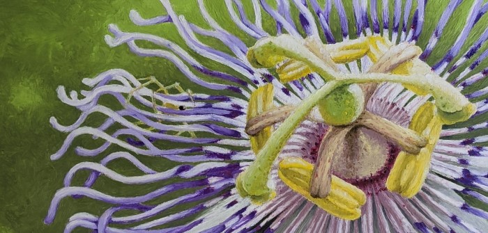
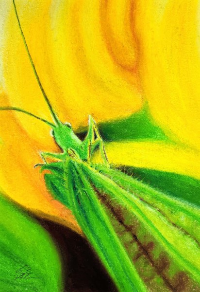
Here it is: Another ambitious undertaking, the subject more fantastical than I’m able to even fully capture. Though it looks tropical, it grows happily right here in the Missouri Ozarks.

The passionvine is a vigorous fruiting vine capable of growing 20 feet in a year. My latest oil pastel painting highlights an exuberant 2-inch bloom of one of my very own vines.

The striking petals are arranged as though they were part of a tiny carousel of color. Sweet honeydew produced by the passionflower attracts tiny ants, who prey on the plants’ pests in exchange for a sugary meal.
This ballet of symbiosis is complicated by the appearance of an unexpected player: a hungry crab spider. It believes that its small yellow body is hidden beneath the thin purple petals. Can you see him? The insect below doesn’t seem to.

This piece began with an 11×17″ sketch, traced from my reference photo print directly onto my cotton canvas. The flower has countless intricate petals. I’ve drawn about 100 of them (yes, I counted!). Everything about this vine from the alien-like center to the outlandish colors, is almost otherworldly.

When I start adding color, I need to fill in the background between each of the impossibly slender “petals” of the flower. The photo is a clear capture at high resolution, but there appear to be more petals than I’m seeing. The only way to know is to go see the flower in person.

When I look at a bloom in my garden–Ah! It makes sense now.
I can see that there are multiple layers of petals hidden beneath each other. And I understand the odd angle of the flower when I can see how it is attached to the vine. Even if I’m just painting one part of the subject, knowing what surrounds that part makes me paint it more accurately.

They come in white too!!

Reference photos are very helpful, but they aren’t the same as touch memory and three dimensional observations. Personally observing the subject of my art helps me better understand:

  • Color variations and textures that a reference photo may not capture.
  • The anatomy and structure of the subject in 3-D (photos are flattened and show only one angle).
  • The nature of light and shadow and how it effects the subject. Time of day, surroundings, and other objects casting shadows all come into play.

This is one reason I don’t usually paint things like tigers or Grecian ruins. (I also can’t afford Greece right now!).
Right outside my door are flowers, toads, mushrooms that I can see and photograph–and so interpret them with detail and surety. Sure, I could make a picture of a tiger from several internet photos. But I would really know and appreciate my subject better if I went to a zoo and watched the tigers there, taking my own photos.
In-person observation is what will make my piece more accurate in the end, giving me confidence to use bold, sure strokes in my work, rather than guessing and erasing.

So…back to the work at hand. I’ve gotten the beginning of the background filled in, and the center is nearly complete.

Half-done piece with tools, colors used and storage tin. I made my own mini green pastel out of my giant one, using wax paper and tape as a wrapper!

Halfway through, I’m realizing that the flower is beginning to look how I want, and the background…well, does not. The neon green seems to be competing with the purples and lemons of the flower. The best way to determine if the piece is properly balanced, is to remove the distraction of color. This is easy to do with a phone app or a free online editing tool: https://grayscale.imageonline.co/

Greyscale image. Background is roughed in and halfway done.

I can see that the values (lights/darks/mid-tones) are defined so far. However, when I look at it in color again, I definitely need to bring the green down a notch to really highlight the gorgeous purples of this bloom. Adding some deep grey subdues the green a bit, making the purple stand out more, but I’m not satisfied with it just yet.

I replace the larger flying insect in my photo with a tiny ant, looking tentatively up at the danger lurking above him. He measures just 3/4″ long on my canvas.

Though I’ve put the finishing touches on the piece and peeled the masking tape off, I don’t feel that sense of completion I usually do. For something that’s practically neon, it’s kind of…”blah”. It’s missing something. But what?

As I watch a video from an artist I’m following, she mentions something helpful that makes it click into place. I layer a translucent tone of purple over the darkest shades on each petal.
Immediately, there is a new level of depth that makes the picture really pop. I definitely need to remember to use translucent-toned pastels for greater depth. Opaque colors are duller and let less light through.

“Dangerous Dance”, 12×16″, oil pastel on cotton canvas. Copyright VLeigh Artworks, 2020

I’m glad to have had the opportunity to portray the passionflower. It certainly is a magical sort of plant–its sedative properties treat anxiety and insomnia, and it produces an egg-shaped edible fruit also known as a “maypop”. The name, “Passiflora Incarnata“, was coined by missionaries visiting South America, who saw the structures of the flower as representative of aspects of Christ’s crucifixion.

Closeup on the little yellow crab spider

Though I will be expanding to other themes soon, I am enjoying these “glamour portraits” of Ozarks-local flora and fauna. These ordinary little things can be as interesting as Greek ruins or a tiger, when you get your nose up in them. I hope to inspire other people to discover these things worthy of appreciation and observation.

Next time you step outside, what little wonder might you notice that you haven’t before?Share your discoveries in a comment below!

How to Frame Your Oil Pastel Art

“Among the Lilies”, matted and framed

You finished (or purchased) your first oil pastel art piece. Congratulations!

But… now what?

The unique properties of oil pastel that make it richly textured and reworkable also make it susceptible to smudges, dust and debris. So, it will need to be matted and framed.
Some oil pastel artists use a spray fixative and display their work without glass. I am accident-prone and can’t trust myself not to bump into a piece, plus some fixatives may have a slight darkening effect. Consequently, I choose to frame my art.

Professional framing is wonderful, but this gets expensive quickly–especially for larger work. While I’m **not a professional framer**, I’ve found a DIY routine that will preserve my art beautifully for years and is saving me hundreds of dollars. This process works for pastel, oil pastel, charcoal, or other framed art, requires only simple tools (a drill, screwdriver, scissors) and can even be fun. Ready? Here we go!

First, shop for a frame.

I start by looking for a solidly built wooden frame with glass.
Wooden frames are easier to drill into if I need to move or replace hanging hardware. Some good places to shop are local second-hand/charity stores, followed by flea markets and garage sales or auctions. New frames go on sale regularly at craft stores. Bring a tape measure when you shop, measuring from the back, inside frame dimensions rather than the front outside dimensions of the frame (as shown in the frame pics below).

[ A note for artists: I choose my frame before I even start the piece. I’ve found that it is much easier to make art that fits a frame than to find a frame that fits the arbitrary size I made my artwork. If possible, choose a common ratio that is easy to find frames for and size up and down for prints— 11×14″, 16×20″ etc. When beginning your piece, cut your canvas/paper just slightly smaller than the inside measurements of the frame. Then mask off your working area to just slightly larger than the innermost mat dimensions, leaving a clean perimeter around the working area for the mat. ]

The working area of this piece is masked off with canvas strips that cover the perimeter where the mat will rest when the piece is complete.

Ideally, the frame will come with a double mat which will separate the art from rubbing against the glass. Double mats are also great for enhancing your art with extra visual punch–drawing the viewer in like a great haircut around a pretty face.
I found this matted frame for under $15 at a charity store clearance sale.

Next, take it apart.
If there is paper protecting the back from dust, tear as much of it off of the frame as possible. Carefully bend up or remove the staples/tabs/turn buttons with a flat-head screwdriver and pop the art and mat out, if the frame came with art or a print in it. Save the cardboard backing. Use furniture polish to clean the frame, soap and water for the glass. A very slightly dampened paper towel removes any streaks on the glass.

Fix up the frame.
This one had nicks in the wood and paint streaked on it. Very fine grit sandpaper removes paint, and wood-tone furniture markers fix shallow scratches, sanded bits and missing varnish. If the frame is missing a lot of paint or stain, I just sand it and re-paint it simple glossy black.

Check the hardware.
This frame came with hanging wire attached, but it was oriented vertically and I needed it to be horizontal. I unscrewed the hardware, and drilled new holes a little smaller than the hardware screws a third of the way down from the top of the frame (horizontally). Later I will replace the wire which will need to be longer now.

Replace glass if needed:
I also somehow cracked the glass the frame came with (yep, accident prone), so that needed to be replaced too. As a side note– if you ever break a large piece of glass, put on gloves, wrap the largest pieces in newspaper and tap them with a hammer to break them down. Wrap tape around the glass-filled newspaper and put it in a cereal box or bag for safe disposal.

I had a couple of replacement options: I could get plain glass or plexiglass/acrylic, which is lightweight and shatterproof. Some art competitions have weight limits, necessitating the acrylic. Can’t decide? Read this:
https://www.logangraphic.com/blog/glass-versus-plexiglass-which-is-better-for-picture-framing/

A hobby store may have cling-wrapped sheets of clear plastic, and those stores also frequently have online coupons available.
You could also use the plastic from a cheap poster frame, trimming it to size with scissors. This option would work well for a smaller frame. For my large piece, thin plastic was too floppy to lay flat in the frame. I got a piece of 24×30″ glass cut down to size at a home and garden chain-store for $12 minus tax. You can also find small frames with glass at a dollar store.
If you can afford to, get museum glass. It reduces glare and reflections, while protecting the art from harmful UV rays. This link helps explain the different types available:
https://blog.frameusa.com/what-are-the-different-types-of-picture-framing-glass

Update the mat.
You can use the original mat if it is not warped or wrinkled. Any faded colors or water stains can be painted over.
For this one, I carefully masked the inner mat and covered the stained outer mat with matte finish $1 craft paint mixed in a teal tone complementary to my art. I used a small roller for quick and smooth application–be sure to remove any paint lumps that appear before they dry.
You can also get a new standard-size mat at a craft store. A store with a framing department may be able to trim any mat you bring or buy for a small fee.

Painting the mat

I am paranoid about the mat being acid-free, so for old mats I cut pieces of sketch paper to the dimensions of the mat, and paste them to the underside of it with acid free glue.

Gluing acid-free paper to the underside of the mat

Elevate the mat off the art slightly so the O.P. doesn’t rub off onto the inner edge of the mat. This will also create a little “pocket” where any extra pastel crumbs will fall instead of floating around in the frame.

The “crumb pocket” in this frame is visible here as a shadow under the inside of the mat

You can do this with strips of double sided foam tape (found near hanging hooks and hardware at a superstore), affixed to the inner edge of the mat. Make sure the tape will be at least 1/8″ from the painted part of your art. Cut strips of paper the same size as the foam strips and stick them to the exposed sticky sides, preventing the mat from getting stuck to the art.

Place a piece of acid free cardstock or sketch paper directly underneath your art as a barrier from the acids in the cardboard backing.

I don’t have paper large enough, so I’ve taped two pieces together to go under the art (taped side away from the back of the art)

Finish placing hardware.
Replace the turn buttons you removed to get the frame contents out (if they were staples or nails, you’ll need new turn buttons). When replacing old hanging hardware, I prefer D-rings and wire for supporting lots of weight without sticking out too far. D-rings and wire can be found cheaply at “Wallyworld”, and new turn buttons at a big-box craft store or online. Wire one side of the frame and leave the other unwired for now because you will be adding a paper dust cover for the back.

Adding turn buttons to the frame.

Cut a dust cover.
You can find rolls of brown paper sold with shipping supplies. I “measure” the paper by setting the frame on top of it, drawing on the paper around the outside perimeter of the frame, and cutting about a quarter inch smaller than the pen markings. I use acrylic medium to glue it down, but school glue or wood glue would probably work. Make slits in the paper where the hanging hardware is so you can cut around it. Then attach the wire to the other side of the hardware.

If you will be hanging the art near a window, you can even get a roll of uv protectant sheets to apply to the glass to protect it from sunlight, available from online retailers.

I stick felt bumper pads to both bottom corners to elevate the lower half of the frame off the wall so it will hang more evenly, since wire hanging tends to tilt the picture at an angle off the wall.

Bumper pads are also available with hanging hardware

There–all done, and at a fraction of the cost! Your art is now ready to be hung.

Framed and on display.


Questions or comments on framing your work? Let me know below! 🙂

“Fragile” / Tools of the Trade
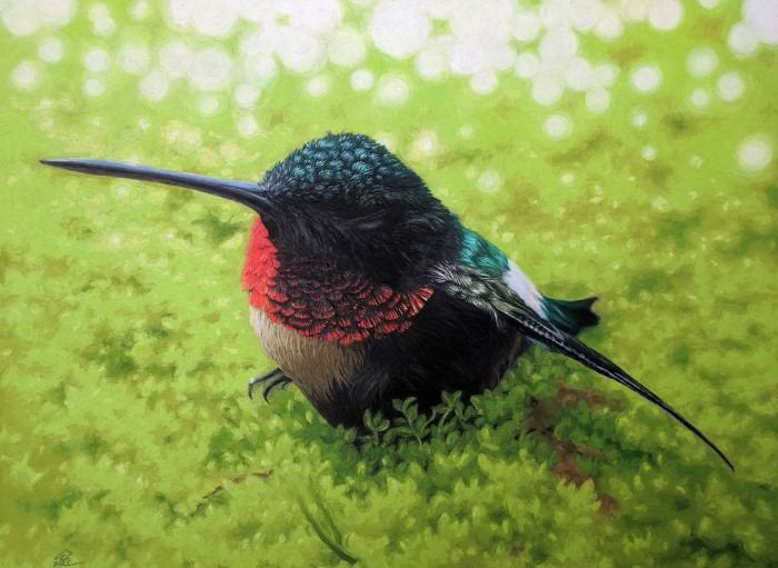
“Fragile”, my latest adventure, is newly complete. It is my largest oil pastel work yet at 24″x29″. The piece was inspired by a hummingbird I found injured under a feeder. He was likely on the losing end of a territorial battle between males, and was lying motionless on the stone ground. I wasn’t sure how to help, but I scooped him up and gave him some sugar water, watching to see if he would perk up. He did recover in a couple of hours, and took off to hopefully have a better day.

It’s not often you get to see any bird so close, particularly one that is constantly in motion like the hummingbird. Its metabolism is so high it can die in a matter of hours if it doesn’t either eat or fall into “torpor”–a high price to pay for an energetic life. (Here is an interesting explanation of hummingbird metabolism–https://journeynorth.org/tm/humm/EnergyTorpor.html)

I knew I had to try to depict the fleeting beauty and frailty of this tiny gem. This piece needed to be large, large enough to really give the viewer a close-up look at this bird’s beautifully constructed metallic feathers. With help from the office supply store, I divided my reference photo into two halves, which I had made into two 11×17″ prints, then I taped the halves together for a nice large reference.

My reference photo. He reminded me of how even the most vigorous of us are fragile, still wholly dependent on He who gives us life.

Two big changes with this piece: new pastels and new canvas. This piece is larger than any canvas pad I can easily obtain, so I bought a 5′ roll of double-primed cotton canvas online.

Next, I got a pricey but worthwhile set of Sennelier oil pastels. I pretty much had to learn how to use OPs all over again when I went to use these. Where other varieties I’ve used are matte, firm, waxy or even crumbly, Sennelier is like a tiny tube of lipstick. It goes on smooth, thick and glossy, leaving the impression of a oil painting. The depth of the glossiness makes for luminous lights and richer darks, but the soft stick is not well suited for tiny details unless I’m using a tool to paint (or making a very large piece). I’m using firmer but reliable Mungyo Gallery for much of the background and detail work in this piece.

Under-layers in Mungyo Gallery. These harsh colors will be covered, then revealed as highlights later.

As far as details go, I’m finding that larger is better for more complex work. I can only make something so small before finding the OP is just too big to make a precise mark. Note the work of pastelist Ruben Belloso here: https://wooarts.com/ruben-belloso/nggallery/image/ruben-belloso-adorna-paintings-wooarts-com-06/

This art is stunning–highly detailed and photorealistic. It is also large. Tiny details are a lot easier to paint at 6 inches than at 6 millimeters.

The lightest highlight colors go in first–yellow, bright blue, white. Next, they will be covered with the darker colors to match those in the photo. I use a clay cutter tool to gently scrape away the darker color wherever I want a highlight, a technique called “sgraffito”.

closeup of textures

In previous work I’ve labored long to remove tool marks. Smashing them into the oblivion of the canvas, smoothing over their sculptural quality and blending the colors into a bit of mud. But part of what separates this piece from a photo is the evidence of its handcrafted nature, full of movement and texture. It’s been a lesson in self discipline to simply make a nice intentional mark and just leave it, rather than doing the “smush”.

For this piece, I’ve mostly blended with the OPs themselves rather than my fingers, which keeps the painterly look. To make it look exactly like my photo would defeat my purpose. If I have to, I can always blend with my finger, then go over the top with the pastels themselves to bring the texture back, or I can hand mix the blended color off canvas with a rubber shaper, and brush the blended color on.

This is a good opportunity to show you what tools I’ve been working with:

rubber shapers, tweezers for removing crumbs, scraping tool, mechanical pencil, paper towel, pastels in semi airtight box

The question has been asked many times– is oil pastel work considered painting or drawing? Discussions I’ve seen suggest that in cases where the medium at least mostly fills the canvas, working in shapes rather than solely lines, it is painting.

This is where the line between drawing and painting really blurs for me. Dipping a rubber brush into a palette with oily smears of OP, adding details this way definitely feels more like painting–but without the drying time-limit of acrylic, or the funky fumes of oil paint. It’s the closest I’ve come to oil painting but with even more direct contact with the canvas. I even sometimes use a paintbrush for pulling thin layers of color.

My main challenge with this piece is maintaining consistency in lighting and texture. I was initially confused with the colors of light bouncing throughout the photo. Warm sunlight hit the ground nearby, shining nearly yellow thru the green moss. But overhead is the cool suggestion of sky, evident in the bluish highlights on the bird’s head. I went with mostly cool shadows and warm lights, except in areas where the light was not coming directly from the sun behind. Practice and observation will likely make this easier for me to figure out.

Time for a background. My setup: large mug of coffee, full-spectrum lamp, reference photo and composition sketch, angled drafting table, squeaky rolling chair, and pastels/tools

I’ve started laying the background color in circles, which is fun and prevents a texture of scribble lines from developing. To simplify my hummingbird’s surroundings a bit more, I’ve outlined some general shapes on my back-up reference print and roughed in the color on top with OP. Looking at my composition armature also helps me arrange the background.

simplifying background

However, I’ve got to remember that some things that look great in the photo just look weird on the canvas. I can’t lose sight of the fact that I am making not a photo but a painting. It is frequently necessary to deviate from the reference to create a pleasing composition. Sometimes a line or a dab of color will just “feel right”, and this is where the soul of the piece (and its maker) really shows.

Background halfway through, piece 3/4 done

Mostly through the piece, I’m running out of green and patience. I take a needed break while waiting for my new jumbo pastel in the mail.

The “Grande” is unexpectedly huge. I may not run out of this color ever again.

When I hit a snag in blending the background, I rolled my whole table outside and was immediately refreshed by the change in perspective, if not the 95-degree heat index. The natural light reveals things I didn’t notice indoors, and the extreme heat makes even my crumbiest OPs smooth as butter.

The last step is to create the hazy light effects of the background. This is mostly a lot more strategically-placed circles, using yellow and white toward the middle of the picture where the warmer light is, and palest green and white toward the top of the picture where the cooler light begins.

Finally, after burning the midnight oil one night, “Fragile” is finished. It will be making its temporary home in a local gallery soon.

“Fragile”, oil pastel on canvas, 24″x29″

Stay tuned for future posts on how I frame professionally on a budget, and more tips for what to do when you hit a snag in the middle of a project. Adios for now!

If At First You Don’t Succeed

Strange times we are living in, folks. When I finished converting our home office into a studio earlier this year, I would never have predicted the first thing I would create in my “new” space would be a stack of fabric face-masks. I had a newly organized workspace, a vintage work desk (thanks to my sister) I had just refinished, a new overhead light and actual access to things I hadn’t been able to properly reach in years.

Better-organized studio and a large bin of mask making fabric

While original plans this year included starting a new and quite large oil pastel piece, the unexpected appearance of Covid-19 means some projects will be completed a little later than anticipated. And that’s ok, if I can be helping out in the meanwhile. I’m painfully slow at this mask-making project, but I did manage to outfit my immediate family and make a few more before running out of bias tape, then elastic. Elastic hasn’t been available for weeks. Fabric ties are simple enough to make, so that will be my next step to finish this batch.

repurposing my kerchief collection from the mid 2000s

My last art project before all this, was a simple enough subject. I wanted to try my hand at soft pastel, since I had enjoyed it so much while creating this piece (shown below, from a box of old pastels given by an artist friend):

“Five Swans”, soft pastel on paper

-To purchase a print of “Five Swans”, click link below-
Five Swans / peaceful mushroom pastel Pastel by V Leigh Carr (fineartamerica.com)

It was a blast to create and easy to blend with this dusty, chalk-like material. Since this first try came easily to me, I assumed I would have a similar experience a second time around. (I know, I should know better than to assume anything). I started working off of this reference photo I’d taken of a cricket on a squash blossom.

print with corresponding soft pastel palette

The pastels I’d used previously were a limited palette of browns, so I bought a larger new set. Right off the bat these proved themselves to be cheaply made–scratchy, hard, removing pigment as quickly as they applied it. I scrapped my first try and bought a “better” (more expensive) set. These were much better. However, it seemed the longer I worked at rendering the cricket’s surroundings, the more the medium seemed to be fighting me every step of the way. I managed to finish about a six inch block of work before giving up on it. I trimmed it down to the finished bit, and went ahead and framed it anyway.

“Small Perspective”, 5×7″, soft pastel on paper

It’s not a bad little piece, but I definitely need more practice, paper made for pastels, and a high-quality set of soft pastels before I attempt finished work in this medium again. I still had some curiosity about what a larger finished picture of this cricket would look like, so I tried again, in my favorite medium: oil pastel. I got many hours into the background before I finally cut my losses. Not only was I missing a crucial shade of lime green, but I was in danger of seriously overworking the background in an attempt to get a “soft-focus” look. I took the whole thing and stuffed it into the trash, with very little regret.

Even a scrapped piece is a great learning opportunity. I got to try out a wash with mineral spirits, and I got to try a new texturing technique which was very satisfying.

Loving the textures I can get with these oil pastels

One thing I’ve learned in the last couple of years is to know when to push through a rough patch and when to quit while I’m behind. I used to just force my way to finishing a piece, whether it looked good or not, because I didn’t want to waste the time and materials I’d invested in it. Now when I hit a big snag, I evaluate my work so far to determine if trying to finish the piece is really the best course of action. The best way for me to know the difference is how I feel about what I have so far (provided it’s not a commission, which I would finish regardless of my mood! ).

Here are some questions I ask myself:

  1. What am I hoping to accomplish with this piece?
  2. Am I “fighting” the medium/trying too hard to force the results I want?
  3. Do I look forward to the next time I work on this piece, or am I dreading it?
  4. Am I overthinking and/or overworking the same spot over and over?
  5. Do I feel encouraged to try again after taking a break of a few days, or do I quickly get frustrated again?
  6. Am I obsessed with finishing it, but not really enjoying the process at all?
  7. Would I be sad, or relieved, if this project were suddenly destroyed?

These questions also work with other creative endeavors, including writing. If at first you don’t succeed, do try again. Sometimes you simply need an even longer break from your work.

But when all else fails, revisit what your goal is with your project. Practice? An entry in a competition? A personal challenge you’ve set for yourself? Will continuing this project help you reach that goal or frustrate you further? Give your work an evaluation before you invest too much into trying to finish a project you hate. Sometimes your energy would be best spent on something else entirely.

Til next time–Over and out, and stay safe at home!

Autumn Fire

Over the Fall/Winter seasons, I spend a good deal of time cooped up indoors, with hectic holidays looming and an excess of craft supplies lying about. So I craft. My holiday-themed items are easy and quick to create, and selling them can be tremendously satisfying. Now, though…the craft fairs are done, I’ve had a nice long break from my art supplies, and I’m recharged and ready to go. February’s piece has begged to be created since this last Fall…

White Flannel Moth caterpillar. Don’t touch!

The subject: A vibrant caterpillar I had unluckily met some months ago. This particular variety has scores of tiny, toxic hairs along its back. Imagine the surprise of absentmindedly reaching into your back pocket, only to feel a sudden sting akin to 20 small wasps all jabbing you at once. After relocating the unwelcome “bug”, I captured his portrait (above) for later use.

A trip to the local office supply store yields a nice 11×17″ print, close to my planned size of 12×18″. Next, I trace a basic sketch for placement (is it really cheating if it’s my photo? Don’t answer that…!). Initially, I try and paint the caterpillar with acrylics. It’s been awhile since I’ve used these and I abort the failed effort early on, deciding on oil pastel instead. My last OP was on paper, but this time I’m trying pre-primed canvas from a 16×20 pad. Next, I attempt an underpainting in lavender for contrast, but this effort also quickly tanks.

If at first you don’t succeed…?

So, painfully, I toss that attempt. Having gotten quite good at sketching this caterpillar by now, I finally draw a draft ready for color. I did realize this time, that regardless of the actual artwork’s size, the canvas/paper needs to fill the frame (16×20″), rather than be cut down to the size of the actual artwork (12×18″). Sometimes I’m a slow learner, haha. I put masking tape over the wide margins of the working area, which will leave nice clean edges when I’m done.

My daughter coloring in one of my many sketches

As I work on what is only my third full-size piece in oil pastel, I’m still learning a lot of interesting quirks of this medium. Temperature makes a huge difference in how the pastel sticks to the canvas— cold pastel holds a hard edge a bit better, but warm pastel blends more smoothly. Keeping my hands warm helps. Working in winter is hard on my O.Ps, constantly circulating air dries them out if they are left out for very long, giving them an unpleasant “gummy” texture. Canvas is proving to be a wonderful surface to work on–though it wrinkles easily, it has a high-quality feel and nice weight, with plenty of even tooth for multiple layers of color.

Seen here is a brush for removing “crumbs”, my warm-toned palette, favorite pencil, a scraping tool for quick fixes, a print for reference and another for color matching. Not shown–some inspiration on TV by the late great Mr. Ross.

Frequently, I only find time to work in the evening or afternoon when the best natural light is failing. One of my favorite tools is a little full-spectrum desk lamp I bring over to get more color accuracy than from my overhead light.

A close-up of the texture in this piece. Loving these colors

One of the biggest challenges of this piece is determining the temperature of the light. I still can’t be sure I’ve chosen the appropriate colors, but I’m having fun regardless. I go for a duller, blurred background and a textured, contrasted foreground. I love finding uses for colors I thought I’d never need, like a greyish-dusty-rose. The background gives me fits as I try to find a balance between textured and blended. Blending with fingers does work fairly well but sometimes smears the colors and usually removes any texture. I’m learning I prefer to blend with the pastels themselves, applying very light pressure, almost none, where needed.

Before putting in the background, I laid a layer of white pastel around the caterpillar for a clear, bright base the subsequent colors can really shine on. A bit of sgraffito (scratching away the upper layer to reveal the white underneath) gives the caterpillar his stinging hairs. He is nearly complete.

The best part. Pulling off the masking tape for a crisp edge and a finished piece

I think this piece has turned out to my best yet, but certainly not my last. I’ve really enjoyed making it, and filed away the lessons I’ve learned for the next piece.

-To purchase a print, click the link below-
Autumn Fire / fall colors caterpillar print Pastel by V Leigh Carr (fineartamerica.com)

Autumn Fire, 12×18″, 2020

Final size: 12×18″, not including margins
Tools: oil pastel, primed canvas, fingers, scraper, pencil
Time: Many short sessions over roughly 3-4 weeks
Lessons learned:
-Leave a wide margin, and mask it well. You can trim it down to fit a frame but you can’t enlarge it.
-Keep pastels warm for best blending.
-Store pastels away from circulating air anytime they aren’t in use, and always leave unfinished work covered and protected from dust.
-Keep multiple sets or doubles of the OPs you use the most often so you don’t run out in the middle of a piece.

Ciao til next time!

Forgotten Prince

My friends, I think I may have found my favorite medium.
The smooth, blend-able glide of oil paint. But no fumes.
The tactile fun of crayon. But richer, and reworkable.
Vibrant, versatile and (mostly) affordable.

I’ve noticed a wide range of benefits and very few drawbacks to working in oil pastel. The medium can be smudged, stippled, scratched, painted–a wide range of techniques. But enough praises…I’ll let the process speak for itself.

Let’s begin with our subject–the humble toad. Not often the star of a closeup, it’s about time this homely amphibian got some attention. A digital photo, above, that I took on our property will serve as the reference (no royalty fees–yay!). I usually work off of multiple photo references, but this time I want the artwork to be fairly close to the original photo. After picking up a quick 11×17 print at a local office supply, I’m ready to begin.

First, a simple reference sketch. Initially I draw a simple sketch at 11×17″, like the photo. No, stubborn Mr. Toad stares me down, challenging me for a level of detail that will do him justice, warts and all. A couple of failed sketches later, and I settle on 17×23″, leaving a 1″ margin all around the edges for matting and easy handling. Next, I lay down a base of buttery yellow pastel over the sketch to serve as a unifying undercoat.
(I apologize for the lack of progress photos of many of these steps, they were lost to an unfortunate website rebuild incident–you’ll have to use your imagination! 😉 )

Then, time for the daunting task of color/texture. I start with the amphibian’s eye–always my favorite thing to draw. I’m trying for a stippled, almost Impressionist look, with vivid, broken color and limited blending. Blending so many colors seems to muddy them, so I’m hoping viewers will blend with the eye. Pounding the paper to produce the countless color dots is great fun, if slow work. And when I make a mistake, it’s not painfully obvious–at just a dot at a time.

Now on to the background. I try the same stippled technique, but it’s too fussy and detailed for a background. I spend a lot of energy reworking it before hearing a helpful suggestion that I mimic the photo and “blur” the toad’s surroundings . There are multiple tools that can be used–tortillons, fine rubber shapers, paintbrushes, even baby oil. I mostly use my fingers, which works as long as I keep them warm (running them under hot water helps), working the colors in all directions.

Mistakes are easy to fix. A plastic tool used for cutting clay can remove multiple layers down to the base color. To develop the blurred look on the mossy stone to the left, I use an old flat bristle paintbrush. It creates a lot of “crumbs”, but these can be scraped off using a clean sheet of lightweight paper, pushed gently along the artwork at a slight angle. A hearty tap from behind the piece (over a trashcan!) removes the rest.The toad’s surroundings change countless times as I try to land on a pleasing arrangement. I draw a composition armature over my reference photo for guidance, since I’m still learning composition techniques.

Finally, many tweaks and reworks later, the warty guy is due for a frame. The biggest problem I’ve encountered with oil pastel so far, is that the work must be framed–the oily medium never truly “dries”, and so remains permanently re-workable (and a lint/dust/pet hair trap). There are fixatives available, but they are costly and I’m nervous about what they might do to the colors. Happily, I found a frame with mat at a thrift store for just three dollars. I clean it, repaint the water-stained mat, rewire the frame for hanging, and attach acid-free backing. It’s extra elbow grease, but this works great until I can afford professional framing. And so our “Forgotten Prince” with his leafy crown is ready for display.

-To purchase a print, click the link below-
Forgotten Prince / surreal macro toad nature pastel print Pastel by V Leigh Carr (fineartamerica.com)

I was amazed by how much intricacy and sophistication there is in something so small and common as a toad. I believe the beauty of all creation truly does speak volumes about its Creator.

Final size: 16×20, after trimming
Tools: oil pastel, heavyweight mix-media paper, rubber shapers, fingers, scraper, pencil
Time: Completed over many short sessions in about six weeks.
Lessons learned:
Use paper with more “tooth”.
Develop a more detailed concept sketch to avoid wasting pastel on reworking.
Don’t be afraid to deviate from the reference photo for better composition.

That’s all for now, folks. But watch out, I’ve got another matted frame ready…

100 mushrooms…and a coffee stain

Have you ever looked at a remarkable piece of artwork and wondered, “How did they do that?”
I have. We don’t normally see the thought process, the mistakes, the interaction with the almost palpable creative energy during the creation of an art piece. Even making-of videos usually have the real learning moments, the “oopsies”, edited out. All we see is the finished masterpiece, like the artist picked up the brush/pencil/digital tool and magically made exactly what they envisioned.
And maybe that’s intimidating.

Art making is not like that–at least not for me. My creative sessions are messy, accidents happen, and sometimes something turns out very differently from what I envisioned. I could try and erase or paint over the mistakes to make it more “perfectly”… or I could learn a lesson from it and celebrate what it IS.

A perfect example is the ambitious piece that was to be “100 Mushrooms”. An 18×24″ neon-bright drawing of, literally, one hundred mushrooms. I was mighty proud as I approached the final mushroom to be drawn. I was not so proud when I absent-mindedly dumped at least half a mug of tepid caffeine on the center of my nearly-finished “masterpiece”.

At first, I was mad. Now…I just find it funny. A good lesson in keeping coffee away from my work, but also in literally cutting my losses. I found two salvageable sections of the piece, one containing forty-two mushrooms, and another with six, and framed two separate pieces. No one (hopefully) would know this was not my original plan from looking at the art.

“42 Mushrooms”

I want to add some transparency to the process of making art. If I can be an artist, anybody can be an artist. You don’t need to wait until you’ve got your degree or your expensive brushes or an 8-hour uninterrupted block of time. Beginners can make beautiful art, and even experienced professionals make mistakes.
So, here is my creative process. I’ll share the inspirations I draw from, lessons I learn, coffee spills I encounter (oops!) . It’s a little bit journal, a little bit instructional, and entirely authentic. I’m always learning…come learn with me.

%d bloggers like this: