
My friends, I think I may have found my favorite medium.
The smooth, blend-able glide of oil paint. But no fumes.
The tactile fun of crayon. But richer, and reworkable.
Vibrant, versatile and (mostly) affordable.
I’ve noticed a wide range of benefits and very few drawbacks to working in oil pastel. The medium can be smudged, stippled, scratched, painted–a wide range of techniques. But enough praises…I’ll let the process speak for itself.
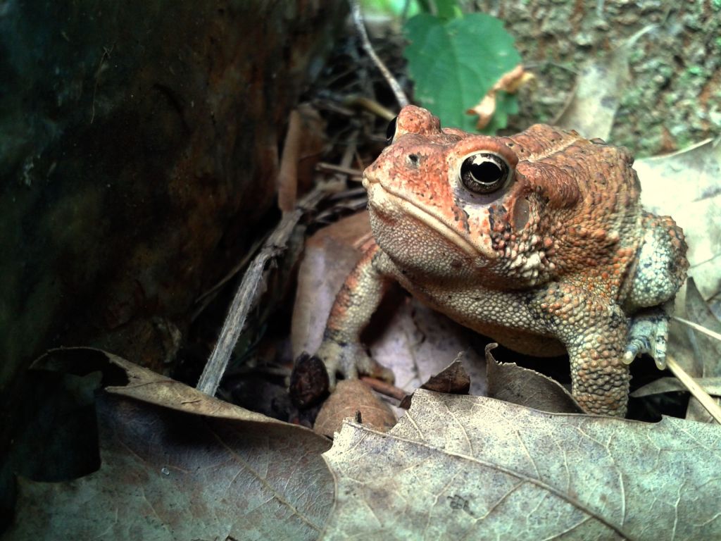
Let’s begin with our subject–the humble toad. Not often the star of a closeup, it’s about time this homely amphibian got some attention. A digital photo, above, that I took on our property will serve as the reference (no royalty fees–yay!). I usually work off of multiple photo references, but this time I want the artwork to be fairly close to the original photo. After picking up a quick 11×17 print at a local office supply, I’m ready to begin.
First, a simple reference sketch. Initially I draw a simple sketch at 11×17″, like the photo. No, stubborn Mr. Toad stares me down, challenging me for a level of detail that will do him justice, warts and all. A couple of failed sketches later, and I settle on 17×23″, leaving a 1″ margin all around the edges for matting and easy handling. Next, I lay down a base of buttery yellow pastel over the sketch to serve as a unifying undercoat.
(I apologize for the lack of progress photos of many of these steps, they were lost to an unfortunate website rebuild incident–you’ll have to use your imagination! 😉 )
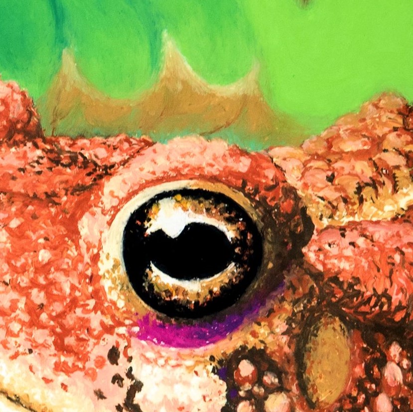
Then, time for the daunting task of color/texture. I start with the amphibian’s eye–always my favorite thing to draw. I’m trying for a stippled, almost Impressionist look, with vivid, broken color and limited blending. Blending so many colors seems to muddy them, so I’m hoping viewers will blend with the eye. Pounding the paper to produce the countless color dots is great fun, if slow work. And when I make a mistake, it’s not painfully obvious–at just a dot at a time.
Now on to the background. I try the same stippled technique, but it’s too fussy and detailed for a background. I spend a lot of energy reworking it before hearing a helpful suggestion that I mimic the photo and “blur” the toad’s surroundings . There are multiple tools that can be used–tortillons, fine rubber shapers, paintbrushes, even baby oil. I mostly use my fingers, which works as long as I keep them warm (running them under hot water helps), working the colors in all directions.
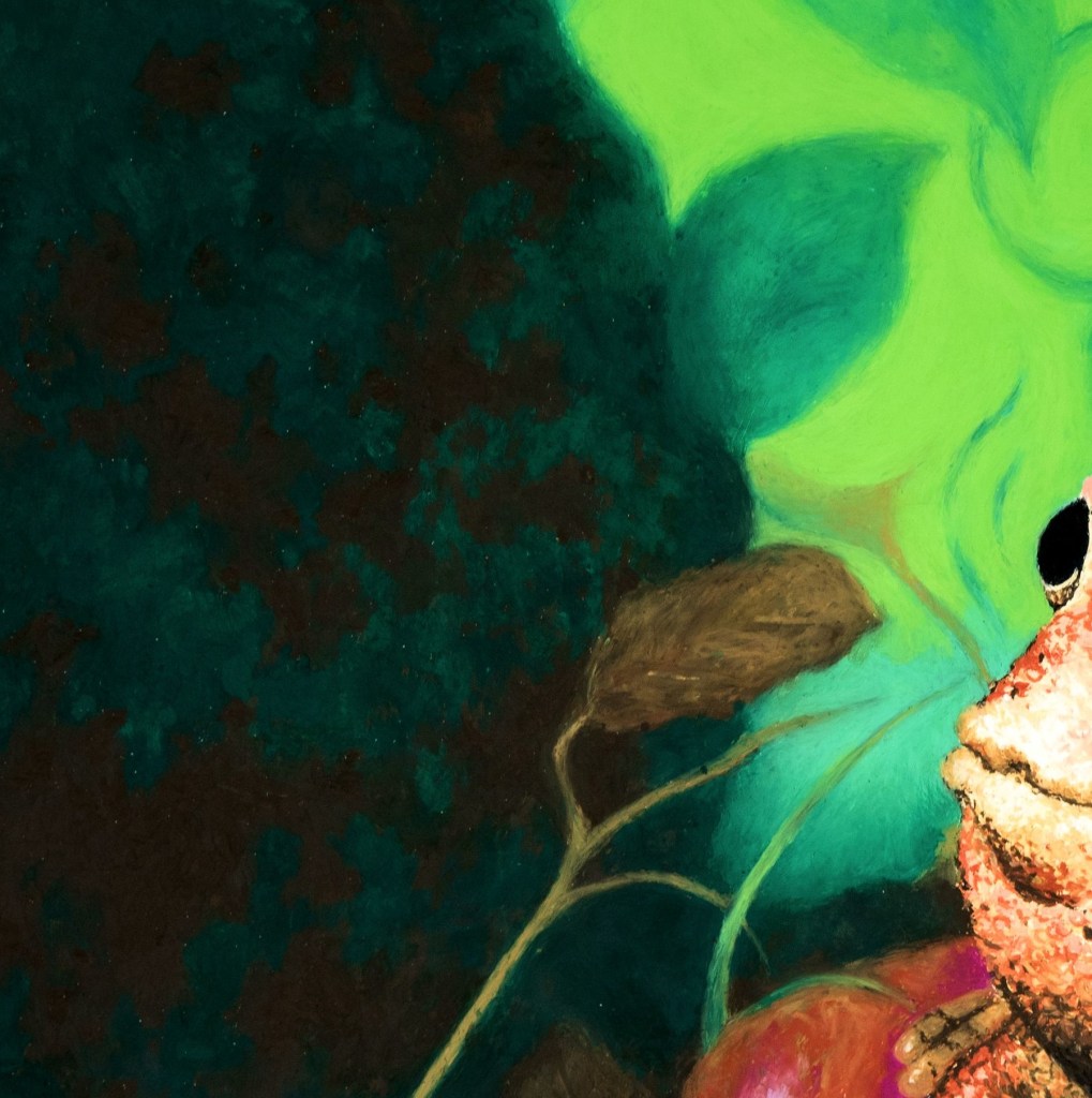
Mistakes are easy to fix. A plastic tool used for cutting clay can remove multiple layers down to the base color. To develop the blurred look on the mossy stone to the left, I use an old flat bristle paintbrush. It creates a lot of “crumbs”, but these can be scraped off using a clean sheet of lightweight paper, pushed gently along the artwork at a slight angle. A hearty tap from behind the piece (over a trashcan!) removes the rest.The toad’s surroundings change countless times as I try to land on a pleasing arrangement. I draw a composition armature over my reference photo for guidance, since I’m still learning composition techniques.
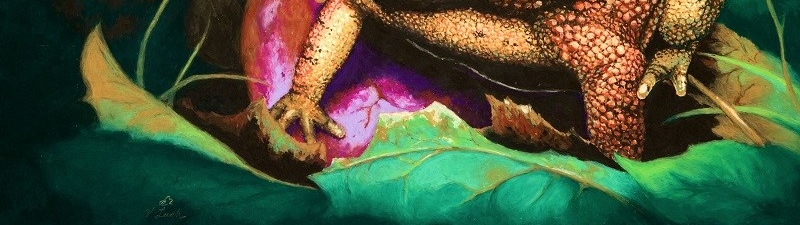
Finally, many tweaks and reworks later, the warty guy is due for a frame. The biggest problem I’ve encountered with oil pastel so far, is that the work must be framed–the oily medium never truly “dries”, and so remains permanently re-workable (and a lint/dust/pet hair trap). There are fixatives available, but they are costly and I’m nervous about what they might do to the colors. Happily, I found a frame with mat at a thrift store for just three dollars. I clean it, repaint the water-stained mat, rewire the frame for hanging, and attach acid-free backing. It’s extra elbow grease, but this works great until I can afford professional framing. And so our “Forgotten Prince” with his leafy crown is ready for display.
-To purchase a print, click the link below-
Forgotten Prince / surreal macro toad nature pastel print Pastel by V Leigh Carr (fineartamerica.com)
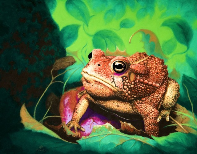
I was amazed by how much intricacy and sophistication there is in something so small and common as a toad. I believe the beauty of all creation truly does speak volumes about its Creator.
Final size: 16×20, after trimming
Tools: oil pastel, heavyweight mix-media paper, rubber shapers, fingers, scraper, pencil
Time: Completed over many short sessions in about six weeks.
Lessons learned:
Use paper with more “tooth”.
Develop a more detailed concept sketch to avoid wasting pastel on reworking.
Don’t be afraid to deviate from the reference photo for better composition.
That’s all for now, folks. But watch out, I’ve got another matted frame ready…
