
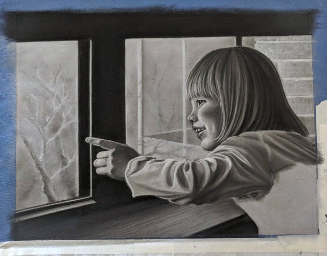
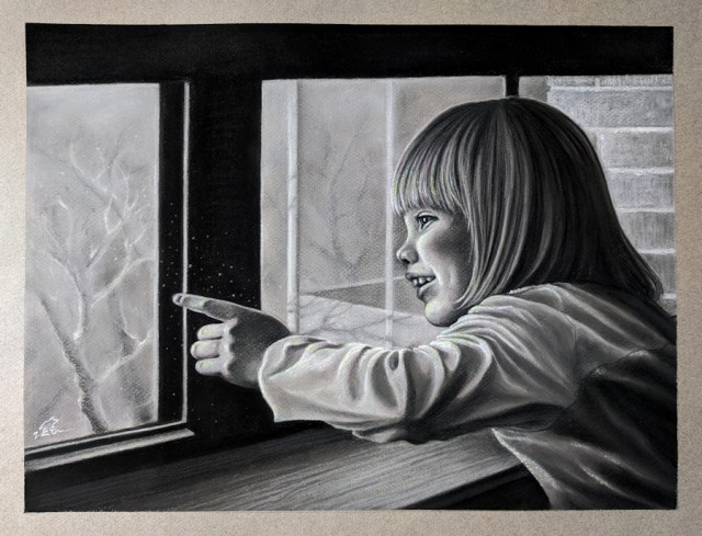
This one is close to my heart, and not just because it’s my first real attempt at portraiture–it’s a Father’s Day gift for my husband, the subject being our little girl. Portraiture is way out of my comfort zone, but I do enjoy a challenge.
It began with the “what if I….” thought that these challenging projects always seem to start with.
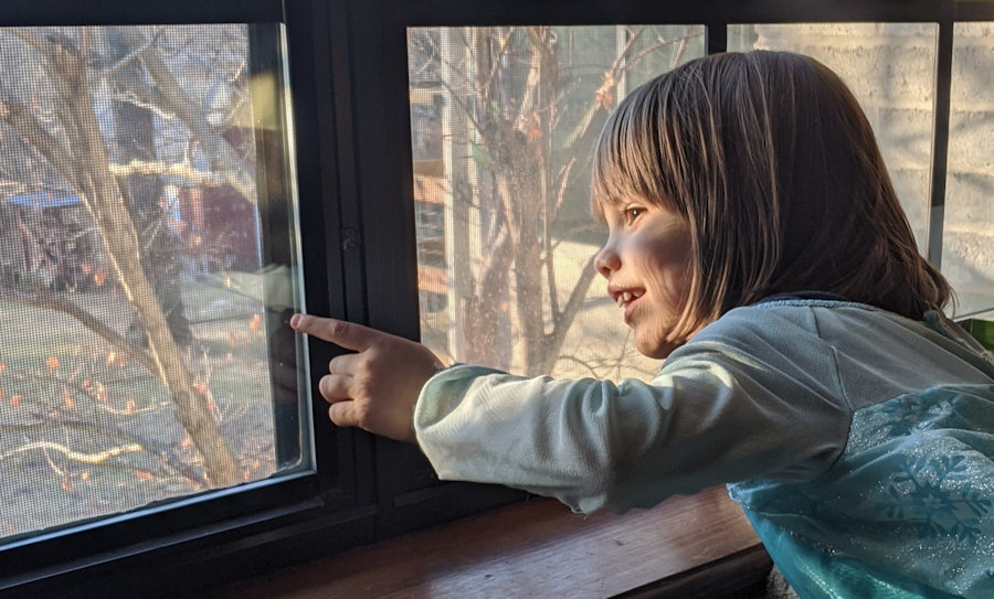
I was absentmindedly browsing through family photos, Father’s Day coming up, and it struck me–
“What if I make this photo a gift for my husband?”. (He is very hard to shop for).
The photo is cute, with strong contrast and a fun pose that might actually make a good reference for…art!
“Yeah, I’m gonna paint this thing instead!”
I should know by now that I always gravitate toward the more difficult option in any situation. Now I’m glad that I did.
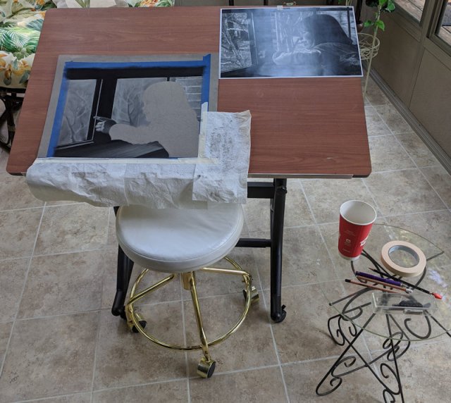
I launched into it with a deadline, meaning I had to land on a reasonable size, find a frame + mat, and get my reference photo printed to fit those dimensions ASAP. Oh, yeah–and choose my medium. Having just finished another oil pastel piece in my nature series, I needed both a break and a new challenge.
Soft pastel would give me plenty of control over lighting and detail. Though I would have liked the fun of making it in color, I went with grayscale to simplify the composition a bit. I chose a mid-toned, lightly textured paper which was delightful to draw/paint on, but it was also too dark to trace a sketch directly over the reference photo.
1: reverse-side tracing over the sketch 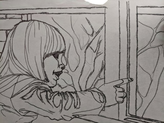
2: the nightmare-fuel result
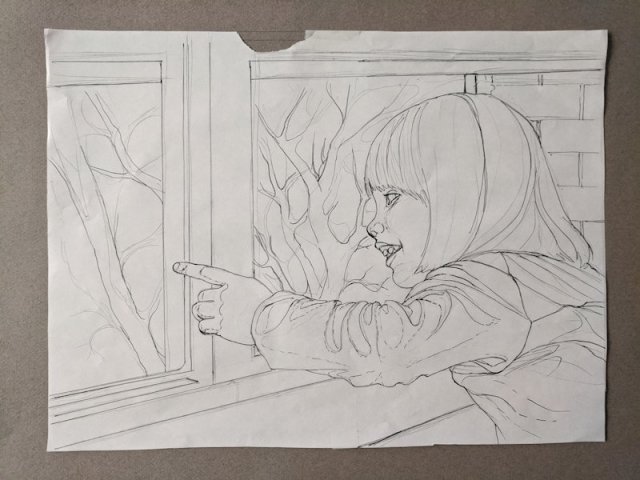
Instead, I drew a simplified sketch onto lighter paper. I then turned it over and held it up to a light, sketching over the lines showing through onto the back of the paper with a soft black pencil. It looked awful, but I flipped it back over and put it on the toned paper, pressing over each line to make a sort of graphite transfer out of the sketch. And now the real work began.
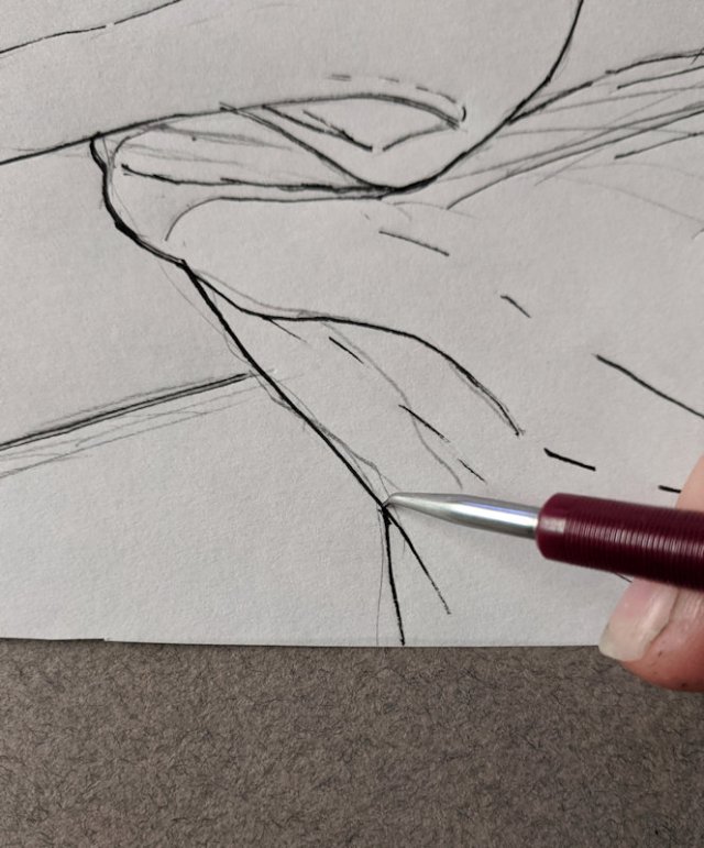
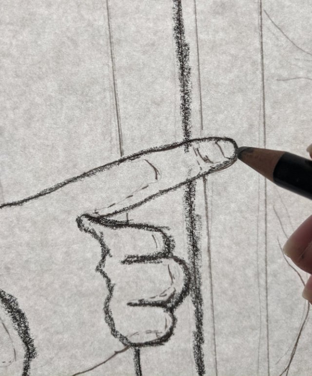
3: pressing over the lines with a blunt pointed tool 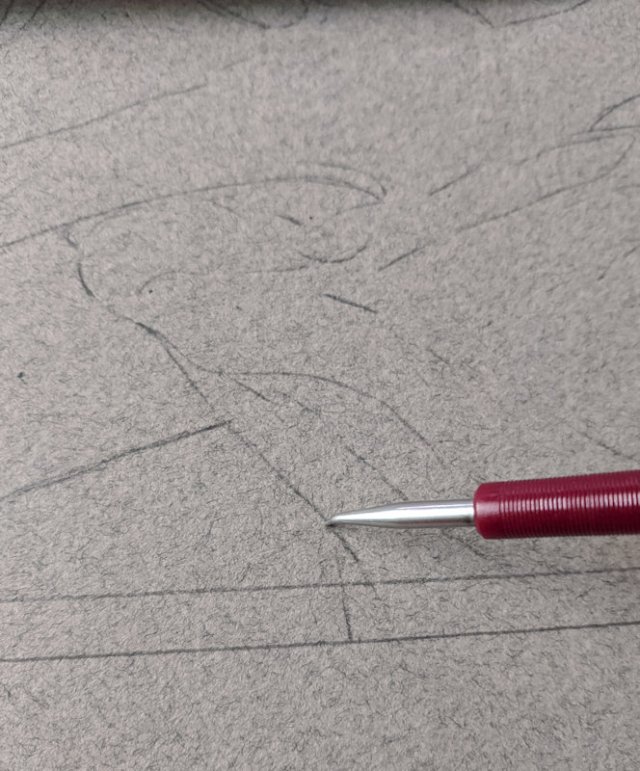
4: the graphite sketch on the back transferred onto the toned paper
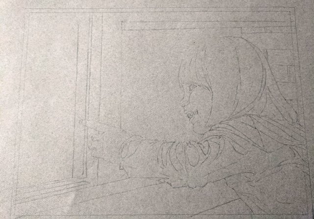
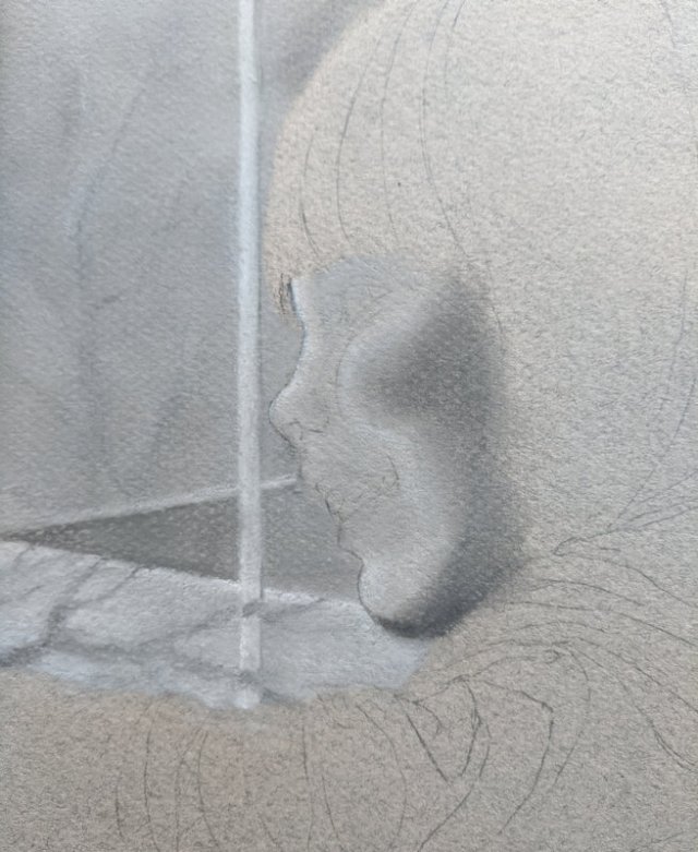
Though I was impatient to draw my subject, I blocked in the composition surrounding the subject first, working top down and saving her for last to lower the chances of smudging my work. The window was first, followed by the scene outside. This one had a lot of fun textures–the shiny wood window frame and the trees and brick wall outside.
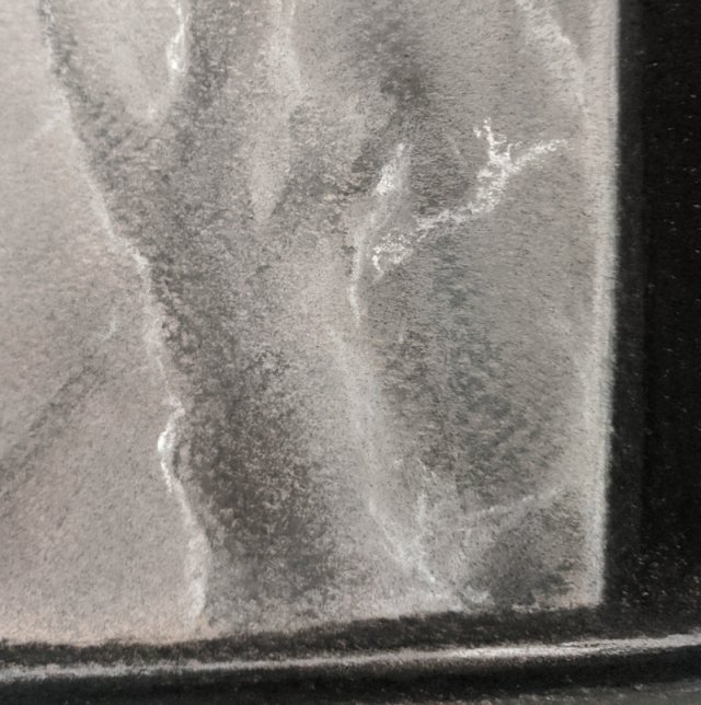
trees outside 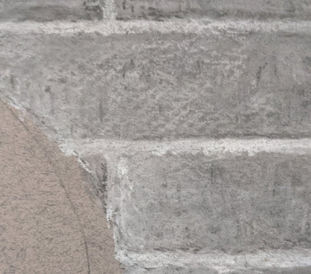
brick wall 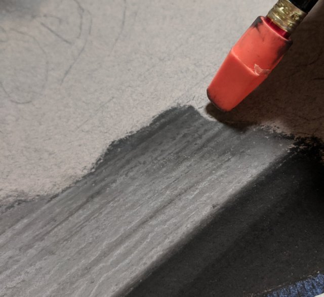
wooden window frame
My biggest challenge was de-cluttering the background. Bare winter branches were poking all over in every direction and the lighting was harsh and confusing.
I drew in some poorly planned imaginary trees which I reworked way too many times before finally replacing them with a simplified version of the reference photo.
poorly planned trees 
simplified background
Now I had established the direction of lighting which would set the tone of the rest of the piece. I used my fingers to blend larger swaths and tortillons for finer spots.
I ran into some unexpected challenges with this piece. At one point my lamp broke… so then I worked in my sunroom to catch the natural light, and I nearly passed out in there from the heat. I had been so far into “the zone” that I had barely even noticed the mercury creeping up over the morning.
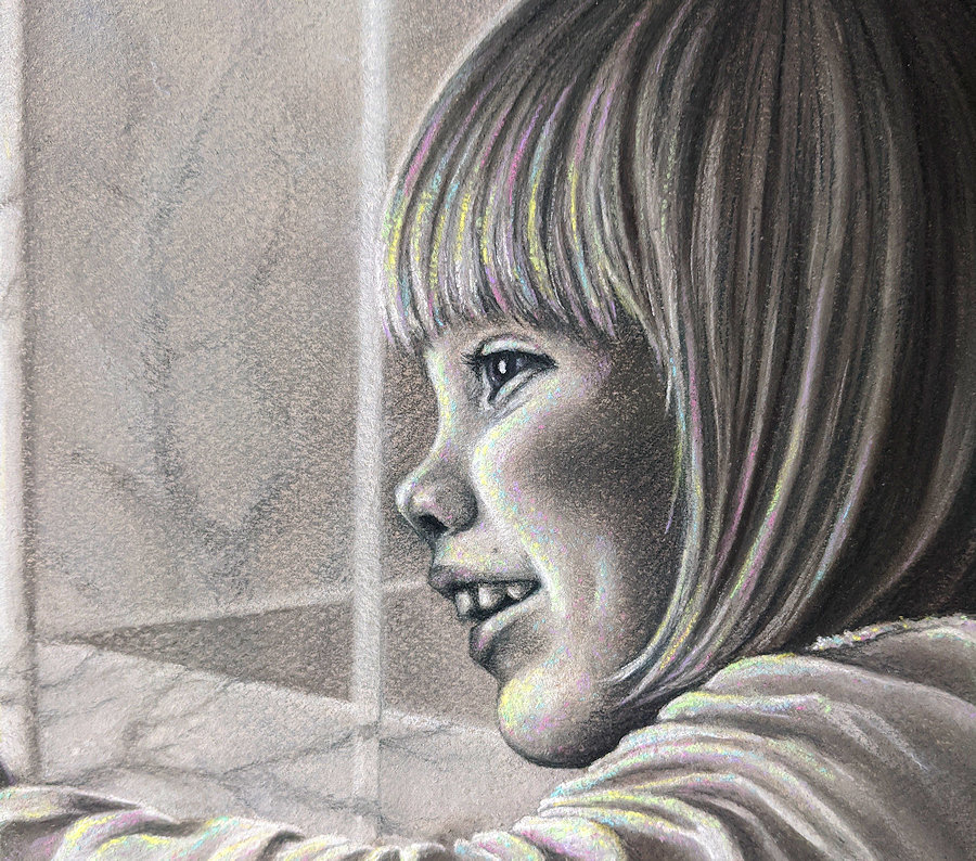
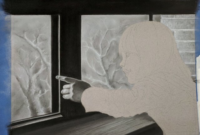
I don’t know if knowing the person you’re painting makes for a better portrait, but I definitely enjoyed painting this face. This is where much of the focus would be, so everything needed to be just right. I liked the technical challenge of matching the photo and the more abstract challenge of trying to capture the magic and authenticity of a fleeting moment.
midtones using softer pastels 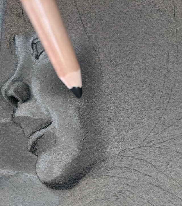
highlights and lines with hard pastel pencils
Initially this was about disassociating from the subject and instead focusing on the shapes her image is made of, the negative space around them. I actually worked on it turned upside down to better capture the “abstract” shapes. Then I flipped it back over to lay in the detail. I tried to steer clear of hard edges for all but the areas in brightest light and of highest contrast.
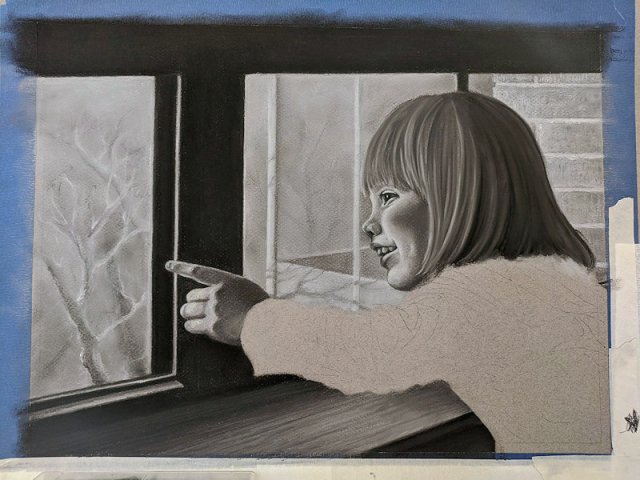
Here, her profile, upper part of her sleeve and her hand all needed to be in sharp relief against the background. I tweaked the tones of her immediate surroundings to better contrast against her outline. Playing with light is one of my favorite things to do, like the reflected light bouncing off of her white sleeve and onto the lower part of her hand. My goal is to eventually be able to do this with the finesse of the masters–but on a smaller scale.
just the corner left 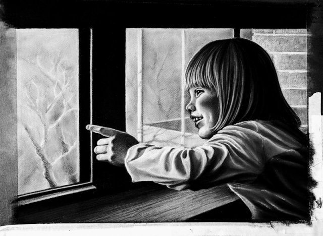
checking light/dark balance with a photo filter
Now with piece nearly done, it resembled my daughter enough for my liking. However, it seemed a bit “off”–the quiet greys and leafless trees were oddly lifeless compared to the energy of the picture’s subject. Then, I had an idea.
Light is a crucial focus in this rendering, and “white light” as we see it, is really just a combination of every color. I was planning on a restful greyscale piece, but I needed to break out my colors.
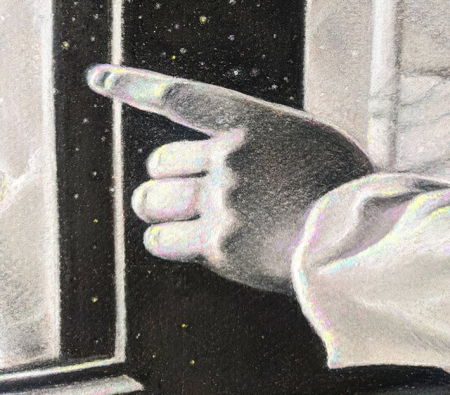
dust motes 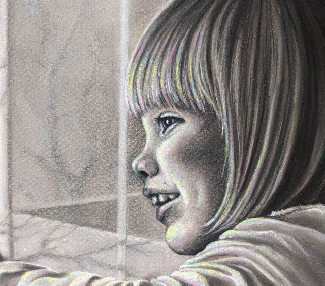
a subtle smattering of color mixed in the highlights
Little dots of neon lime, pink, blue, and yellow added instant life to the painting.
It still registered as “grey” from a distance. Then up close, it sparkled with color like confetti–matching the vivacious spirit of the subject. I dotted in some dust motes for added interest in the left side of the picture, and called it a wrap.
I really enjoyed this piece. Getting to make a portrait of my daughter was lovely, and just the right amount of difficulty to keep it interesting but not too frustrating. I nearly-but-not-quite made my deadline of Father’s Day, just a couple of days past it.
The best part was presenting it to the Daddy it was created for. He was both surprised and pleased!
