
Since my last post, I’ve made several new pieces and shared them with the world.
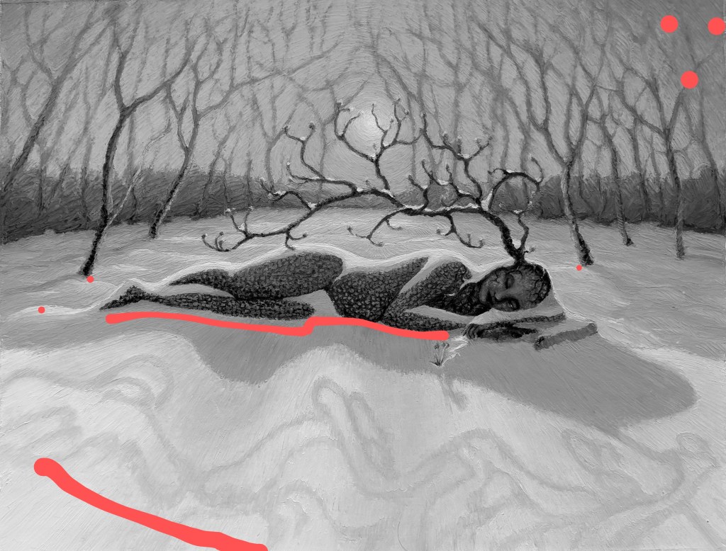
I’m particularly happy with this one, a combination of two of my favorite things…otherworldly themes and oil pastel.
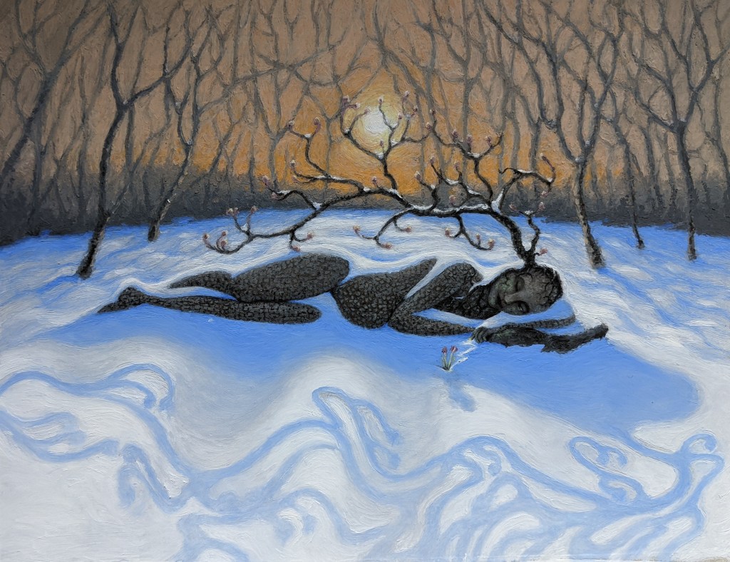
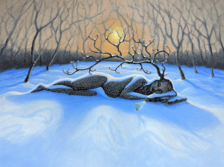
This one is an experiment in texture and lighting, a fun little throwback to some of my earlier fantasy work, and my own contribution of hope for a world in near-constant turmoil. A reminder that Spring does eventually come, no matter how cold and devastating the winter.
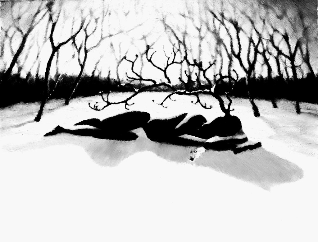
A close view of “Waking Up”:
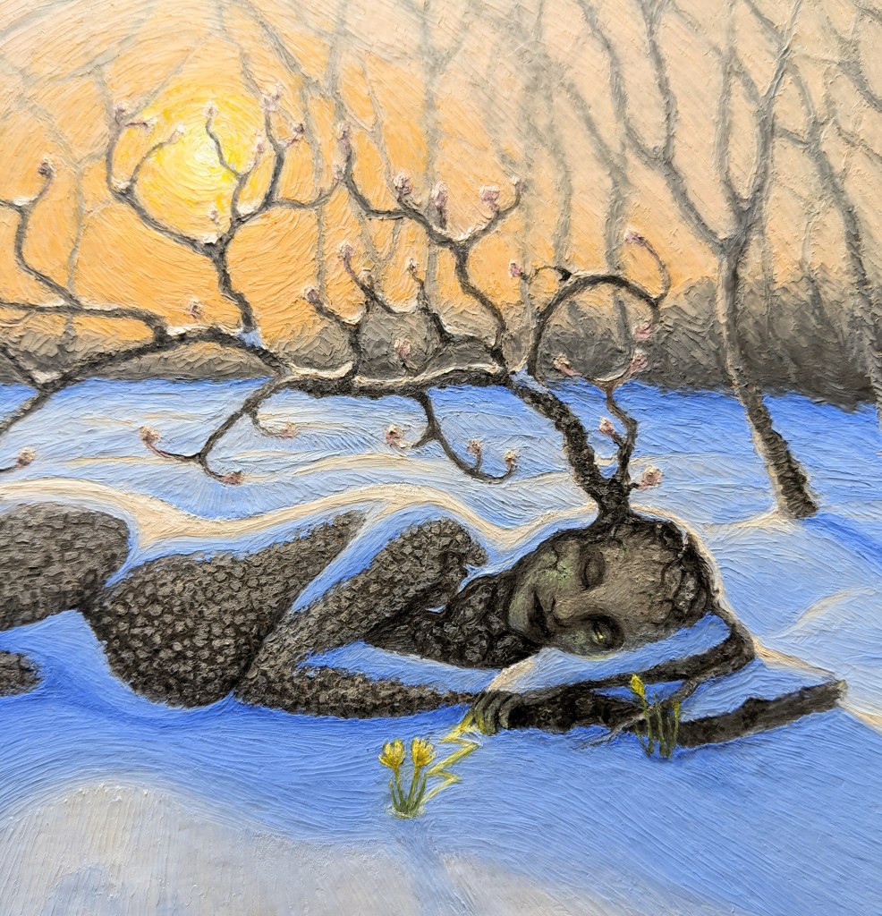
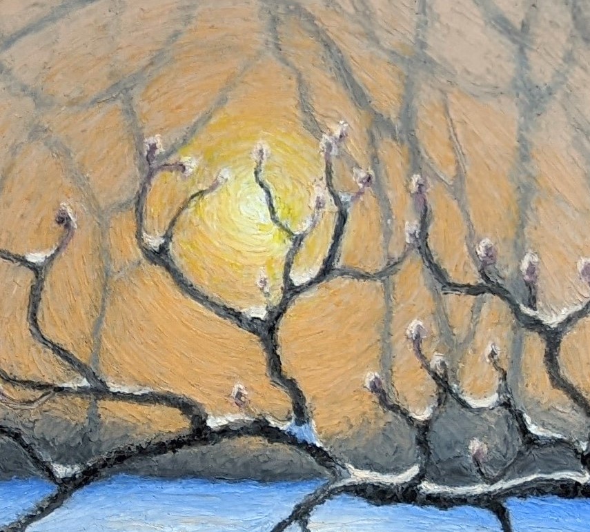
The figure is my interpretation of “Mother Nature”— young, dormant and not yet weathered by Summer. She is pregnant with Spring-yet-to-come. Still mostly asleep under her protective blanket of snow, she lifts one sleepy eyelid, beginning her important work of waking the forest around her. Her hair is the roots and branches of a twisted dogwood tree, forming buds in preparation for its display. Her skin shares the tree’s bark-texture, and a faint blush of new green has appeared on her cheeks.
Scroll to see the making-of this piece. We begin with reference photos:

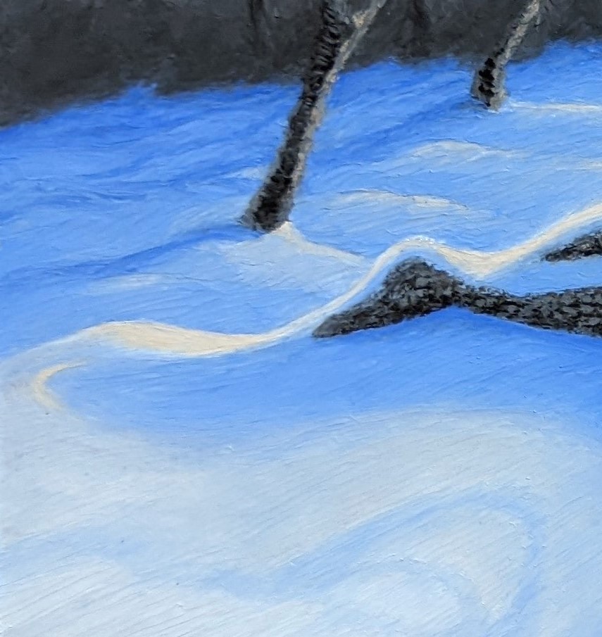
I need to study the colors of the snow in the low light of sunset/sunrise. Very little of it is just “white” as I understand snow to be. The shadows are a strong blue. The sunlit patches are more a pale yellow, even in the brightest spots.
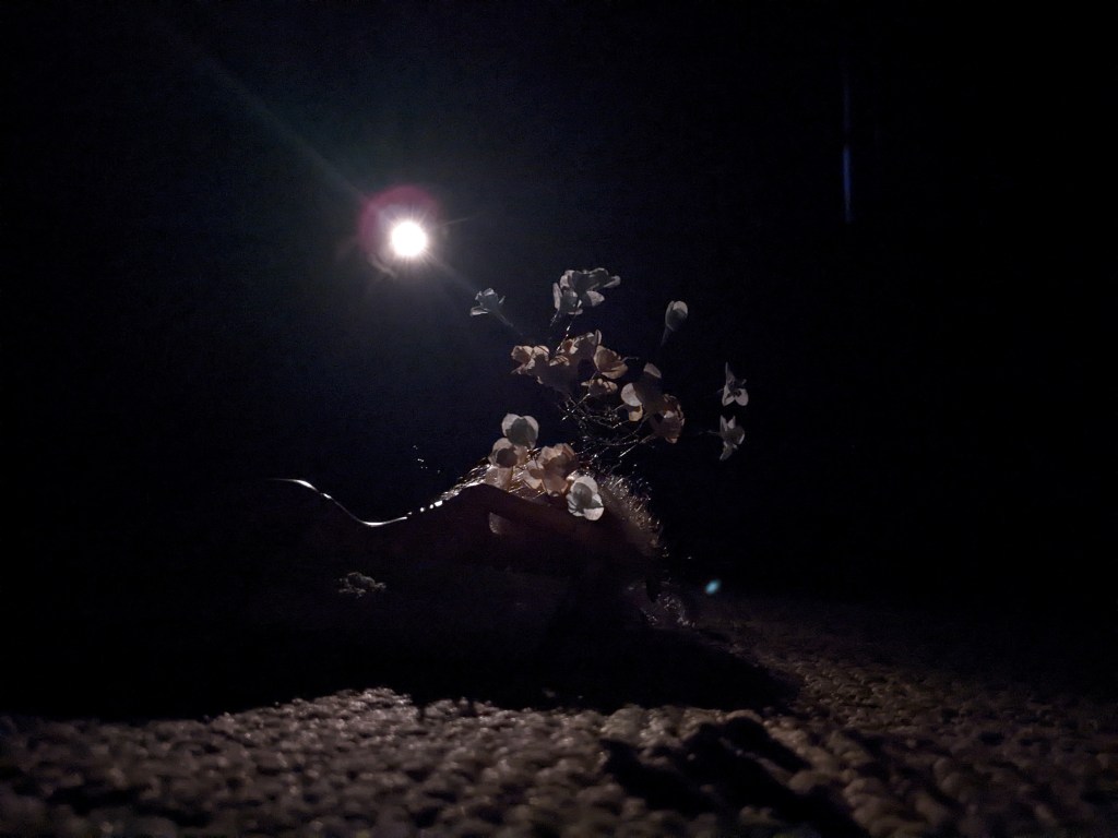
This piece shows me what ridiculous lengths I’m willing to go to for good references–the above is my daughter’s doll, with paper flowers, posed on a cloth on my bedroom carpet, backlit by a flashlight. I have to move a piece of furniture and lay sideways on the floor to snap it. I pose the same doll in a snowdrift to better understand the cast shadows I need to paint. Then, I snap some photos of the stars of this “show”, the humble crocus.
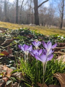
Crocuses are some of my favorite blooms, because they are some of the first harbingers of warmth and green and cheer returning to a cold, stark world. They can bloom in snow, hardy and defiant to the Winter surrounding them.
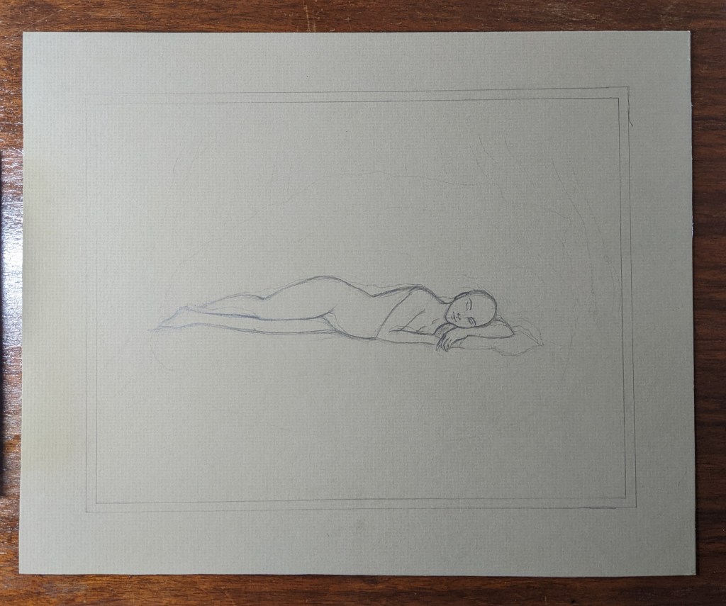
My final reference shot is one of myself in front of a mirror, in a similar pose as the doll. Next, the fun of drawing begins. First, I have a look at my oil pastel rough-sketch.
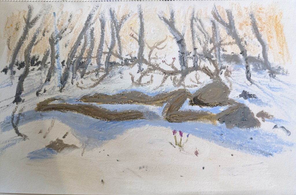
Then I cut a piece of warm-tone matboard to 11″x14″. A sketch goes on next, then laying down the lights and darks. This step of establishing the darkest and lightest shapes is essential to create a balanced and dynamic composition.
At this point I’ve also started adding in secondary details to balance out the foreground, like a fallen log and a few early plants poking through the snow.
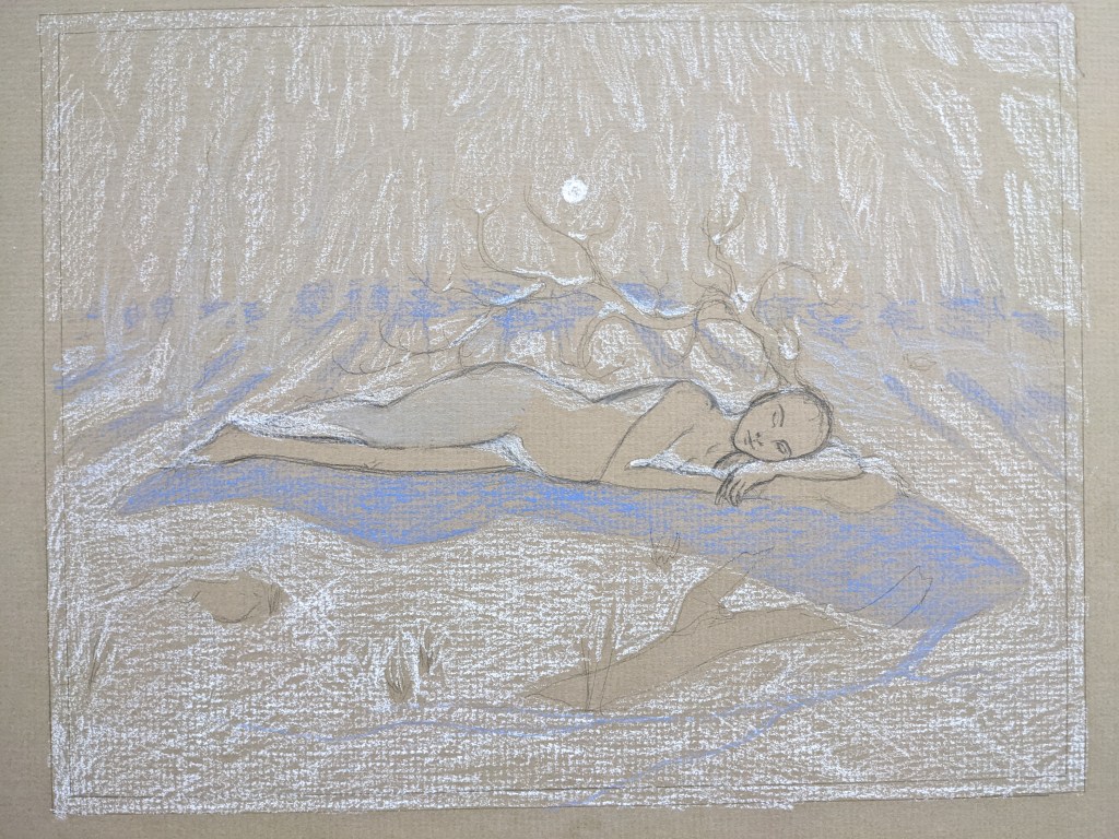
So far, I’m pleased with the sketch– but everything changes the moment color is added. The sketch will be totally obscured and the tonal values I’ve established will become even more important. The base layer consists of a thin coating of my harder, less “oily” pastels. Its purpose is to establish the basic colors I’ll be using, covering the bumpy brownish background of the matboard. It is also much easier to paint the later fine details and textures on that smooth base layer. Below, the background can be seen roughed in, and I’m filling in my main character and the foreground. I’m using my higher-quality, oil-paint textured pastels on top of the base coat.
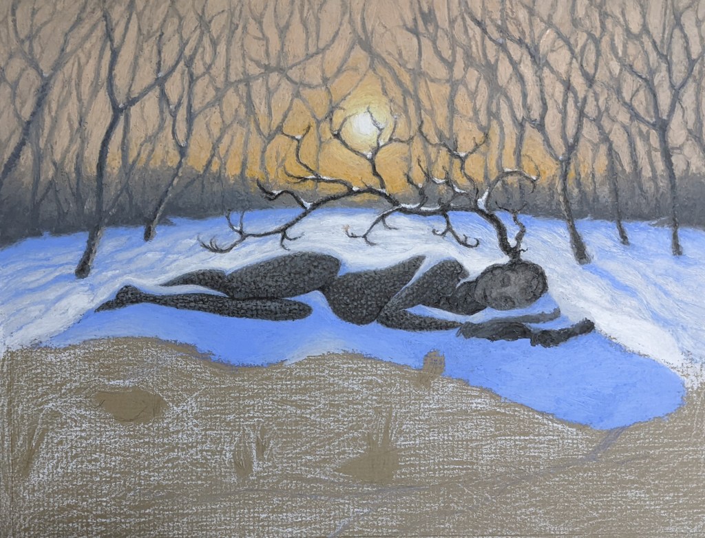
This is where I stall out. Every piece I do has its sticking points where I need to learn something new, so I’m not surprised. I can’t figure out how to compose the foreground in a way that makes sense and doesn’t distract from the subject.
First I try drawing in the tree’s shadow. It’s easily the most complex part of this whole piece, due to its odd shapes that are distorted not only by the low angle of the setting/rising sunlight, but also by the uneven terrain they fall on.
Yeah, that is definitely unnatural and distracting. After taking a long break to get fresh perspective, I look at a small version of the piece on my phone so I can mark-up what needs worked on. Several spots catch my eye right off the bat. Then, I increase contrast to create a “notan”–a Japanese term meaning “light dark harmony”– that helps me simplify my composition so I can spot imbalances and figure out what the foreground is missing.
The conclusion I usually come to on these sticking spots, is to simplify, simplify, simplify. I removed the ill-placed foreground log and brush earlier. Now, I know I need to simply suggest the tree’s shadow and connect it better to the subject’s shadow. With this plan carried out, I can now focus on the final step– details and textures.
Oil pastel can be highly textured, even sculpted using tools. I’m going for an Impressionistic look for this piece, with leading lines pressed into the pigment to create movement around the piece and add interest to “quieter” (low detail and contrast) areas.
The tool I most use is a plastic clay knife. The sharp tip is for scraping textural lines in. The flat side of the “blade” is perfect for smudging and blending similar colors together like the different tones of the shadows.
Though it’s a step with less obvious results, this is an important and time-consuming step that refines and ties together all the different elements of the piece.
Finally, I consider this piece complete. I have enjoyed the lessons I learned on composition, as well as plenty more practice with the complex and characterful medium that is oil pastel.
Happy Spring, readers. May it be regenerative and hopeful for you.

Veronica, that was stupendous! The drawing is beautiful. Not only well composed but detailed and contrasted in all the right places. And your blog description of the process was clear, organized and instructive. I’m very impressed and proud of you niece.
I’m going to proudly share your work and blog with some other artists at the atelier.
Do you have a price on this piece?
Aunt Bethany fellow artist, speech evaluator, teacher, and person who knows of what she speaks
________________________________
LikeLiked by 1 person
Hi there Bethany,
Your lovely comment made me smile! Yes, please feel free to share my work with whomever you would like to. I will email you shortly with price for this piece. Thank you -V
LikeLike
Came here from Instagram. Thank you for sharing so much detailed information – and images! – about your process. I always appreciate seeing what goes into creating works of art and learning what the artist is intending.
This painting is really cool.
LikeLike
Thank you, Joseph! I agree–I’m often curious and mystified by how other artists make their art, so I like to share my process with people. I’m glad that others enjoy reading/watching the creative process too! -V
LikeLike